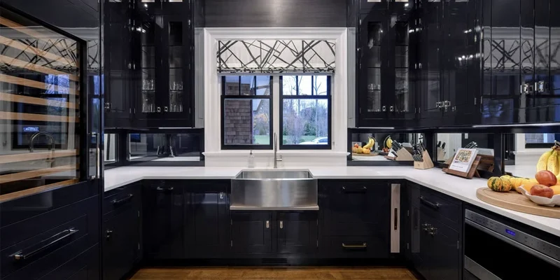
Choosing the best kitchen countertops for black cabinets is largely about managing contrast, light and visual weight. Black cabinetry already creates a strong architectural presence, so the countertop can either lighten the composition, soften it with warmer tones, or reinforce the dark palette for a more dramatic result.
The right combination depends on more than cabinet colour alone. A matte black cabinet in a bright open kitchen may support a completely different countertop from glossy black cabinetry in a compact room with limited daylight. Flooring, backsplash, hardware, wall colour and the amount of pattern in the countertop all influence whether the finished kitchen feels balanced or visually heavy.
This guide compares quartz, granite, quartzite, marble and porcelain for black cabinetry and explains how countertop colour, veining, finish and surrounding materials affect the final design. Rather than treating black cabinets as a single design style, the goal is to help you determine how much contrast, movement and warmth your particular kitchen needs.
Design Principle: Black cabinets already carry substantial visual weight. Countertop selection should therefore consider how much light, contrast and pattern the room needs rather than simply choosing a surface that looks attractive on its own.
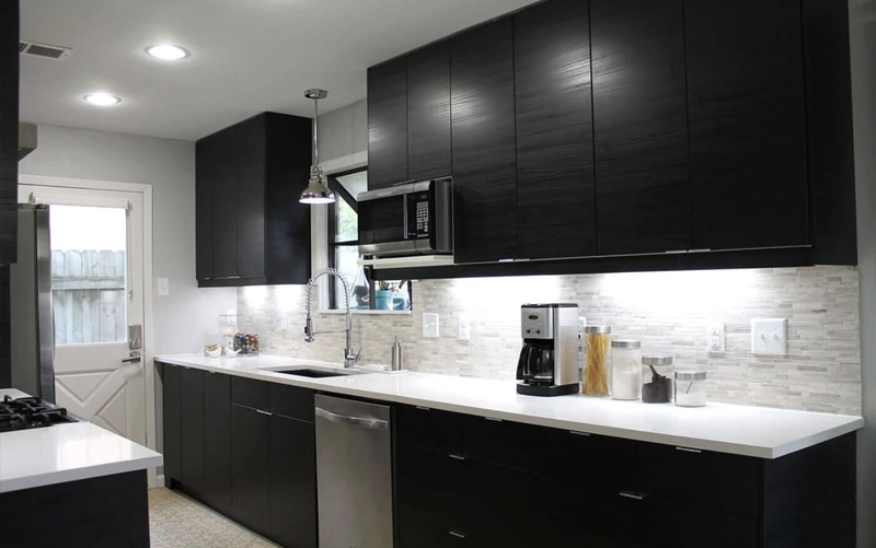
All major countertop categories can work with black cabinetry. The difference lies in how much contrast, natural movement, warmth and visual texture each material introduces.
| Material | Typical Effect with Black Cabinets | Key Consideration | Often Suits |
|---|---|---|---|
| Quartz | Controlled contrast and flexible pattern | Choose brightness and veining around the room’s lighting | Modern, transitional and family kitchens |
| Granite | Natural texture and colour variation | Avoid unnecessary competition between cabinet and stone pattern | Natural, transitional and traditional palettes |
| Quartzite | Strong natural movement and feature contrast | Review full-slab movement and vein direction | Feature islands and design-led kitchens |
| Marble | Soft natural contrast | Natural variation and care expectations | Classic and design-focused kitchens |
| Porcelain | Clean and architectural | Fabrication details depend on the selected product and system | Contemporary and minimalist kitchens |
With black cabinets, countertop selection is primarily a question of visual balance. The cabinetry already provides a deep, dominant surface, so the countertop determines whether the room becomes brighter and more open, softer and warmer, or intentionally darker and more dramatic.
Black surfaces absorb more visible light than pale cabinetry and therefore carry greater visual weight within the room. In kitchens with limited daylight, a lighter countertop can create useful separation and prevent the cabinetry and work surface from visually merging.
White, warm white, light grey and softly veined stone can all serve this purpose without requiring the kitchen to become entirely monochrome.
In larger spaces with abundant natural and artificial lighting, darker countertops become easier to use successfully because the room can support a stronger concentration of dark finishes.
Contrast can range from dramatic to almost nonexistent.
High contrast typically pairs black cabinetry with white or very light stone. The countertop becomes clearly defined and can help visually break up large areas of dark cabinetry.
Moderate contrast uses light grey, greige, beige or subtly patterned surfaces to create a softer transition.
Low contrast combines black cabinetry with charcoal, dark grey or black countertops. This can create a highly architectural look, but lighting, flooring and backsplash selection become especially important because the cabinetry and countertop no longer provide significant tonal separation.
| Contrast Level | Countertop Direction | Typical Result |
|---|---|---|
| High | White / light stone | Bright, crisp separation |
| Moderate | Grey / greige / warm neutral | Balanced transition |
| Low | Charcoal / black | Dark, continuous architectural palette |
Black cabinetry is not visually identical across finishes. Matte black absorbs light and generally creates a softer surface, while glossy finishes reflect surrounding light and can feel more visually active.
A polished stone beside glossy cabinetry may create a highly reflective composition, whereas a quieter honed or matte surface can introduce contrast through texture rather than colour.
Flat-panel black cabinets also behave differently from traditional framed doors. Minimal cabinetry can support more expressive stone movement, while detailed doors, decorative hardware and other strong features may benefit from a quieter countertop.
Because black is such a dominant cabinet colour, surrounding materials strongly influence whether the kitchen feels warm, cool, industrial, classic or contemporary.
Wood flooring can introduce warmth and prevent black cabinetry from feeling overly severe. Light floors can increase overall brightness, while darker flooring creates a much more continuous tonal composition.
The backsplash should also be considered before the countertop is finalized. If the stone contains dramatic veining, a restrained backsplash often gives the countertop enough visual space. If the countertop is quiet, the backsplash can take on more texture or pattern.
Hardware should be treated as another coordinating finish rather than the starting point for countertop selection. Brass, brushed metal, chrome and black fixtures can each work with multiple stone directions when the larger palette is coherent.
Design Check: When black cabinetry, dark flooring and a dark countertop are used together, introduce separation somewhere else in the composition—through backsplash, wall colour, lighting or material texture—to prevent the major surfaces from visually merging.
Black cabinetry is flexible enough to work with every major countertop category. The material decision should therefore be based on the combination of desired pattern, maintenance expectations and the amount of contrast the kitchen needs.
Quartz countertops offer considerable control over the appearance of a black kitchen because they are available in bright whites, warmer neutrals, greys, darker tones and a wide range of veined designs.
A white or lightly veined quartz can provide clear separation from black cabinetry and increase perceived brightness across the work surface. Softer grey or greige designs reduce that contrast, while charcoal surfaces create a more continuous monochromatic palette.
Pattern intensity should also be considered. When cabinetry, flooring and backsplash are visually restrained, stronger quartz veining can serve as the primary focal point. When the kitchen already contains several decorative elements, a quieter pattern can produce a more controlled result.
Many quartz products are nonporous and generally do not require routine sealing, although care and heat-use guidance should always follow the recommendations for the specific product selected.
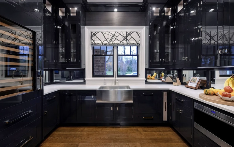
Granite countertops can soften the visual severity of black cabinetry by introducing natural mineral variation, subtle movement and organic colour. The result can feel warmer and less graphic than a high-contrast engineered surface, particularly when the kitchen also includes wood flooring or other natural materials.
Lighter granite can create useful separation from black cabinets without producing the stark contrast of a pure white surface. Cream, soft grey, silver and lightly patterned slabs can all work well when the objective is to brighten the room while preserving a natural-stone character.
Darker granite can also be effective, especially in larger kitchens where the cabinetry and countertop are intended to form a continuous architectural palette. In that case, the backsplash, flooring and lighting become more important because there is less tonal separation between the two dominant surfaces.
Because every granite slab is unique, the full slab should be reviewed before fabrication. Mineral concentrations, colour shifts and movement can affect how balanced the stone appears beside a large field of black cabinetry.
Quartzite countertops are particularly effective when the countertop is intended to become a visual focal point. Many slabs contain strong directional movement that becomes more noticeable against a dark cabinet background.
Light quartzite with grey, taupe or warm veining can create clear contrast while retaining the variation of natural stone. More expressive slabs can work well on large islands, where the uninterrupted countertop surface gives the pattern enough room to be appreciated.
With black cabinetry, slab layout becomes especially important. Vein direction, waterfall continuity, backsplash alignment and seam placement should be considered together before fabrication begins. A dramatic slab can lose much of its impact if prominent movement is interrupted unnecessarily.
Care requirements should be confirmed for the selected slab and finish. Natural-stone porosity and sealing needs vary, so maintenance should follow material-specific guidance rather than a universal schedule.
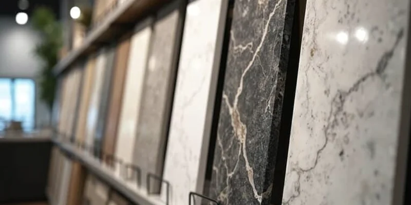
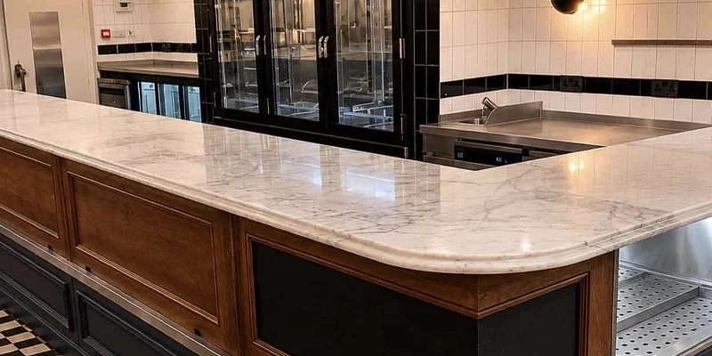
Marble countertops create one of the clearest natural-stone contrasts with black cabinetry. Light marble can visually lift the work surface while its veining prevents the combination from feeling overly flat or graphic.
This pairing is especially effective when the rest of the palette is controlled. A marble countertop, black cabinetry and restrained flooring or backsplash can create a strong focal relationship without introducing several competing patterns.
Marble should be chosen with realistic care expectations. Acidic ingredients can etch calcium-based stone, and natural variation is part of the material rather than a defect. For homeowners comfortable with those characteristics, marble can create a distinctive and highly individual result.
Porcelain countertops suit black cabinetry particularly well in contemporary and minimalist kitchens because the surface can be specified with very controlled colour and pattern.
White marble-inspired porcelain creates strong contrast, while soft grey or concrete-inspired surfaces produce a more restrained architectural palette. Dark porcelain can reinforce a monochromatic black kitchen when the room has enough light and the surrounding finishes provide visual separation.
Porcelain slab systems vary in thickness, edge construction and fabrication requirements. Cutouts, mitered edges and installation details should therefore be planned according to the selected product rather than assuming every porcelain surface uses the same fabrication method.
Material Strategy: With black cabinetry, the material category matters less than the role the countertop needs to play.
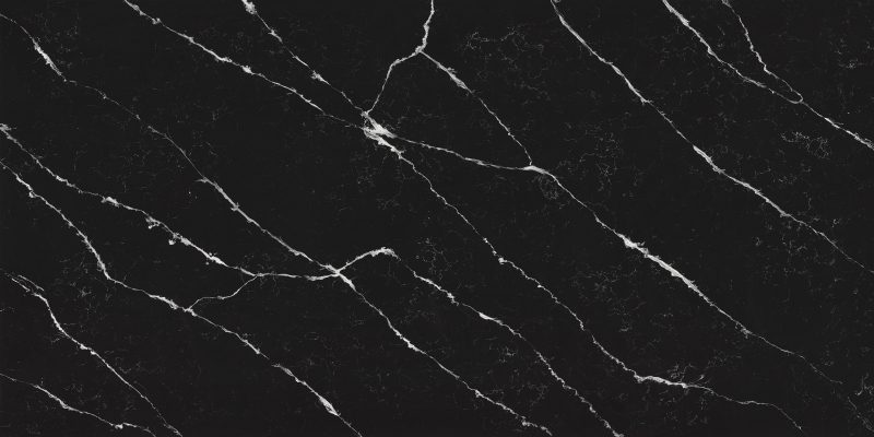
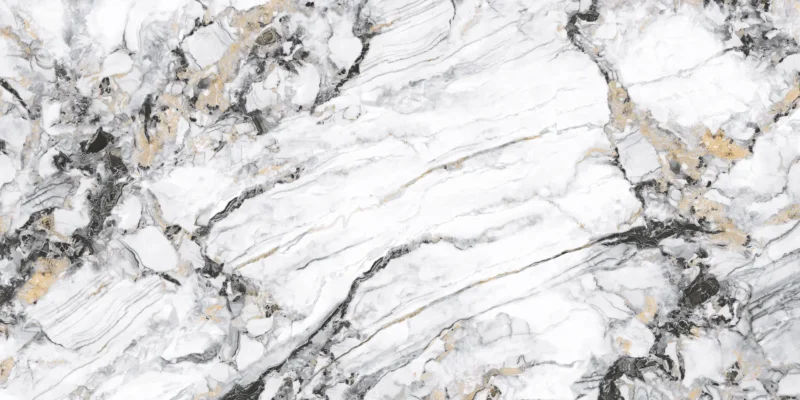


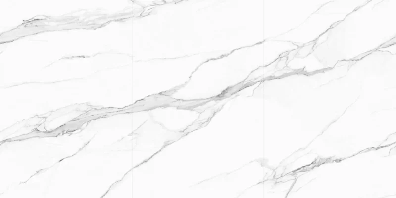
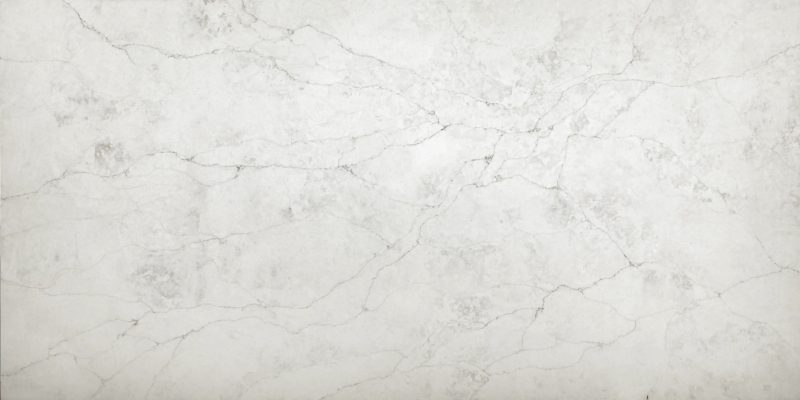

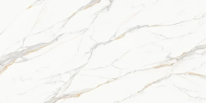
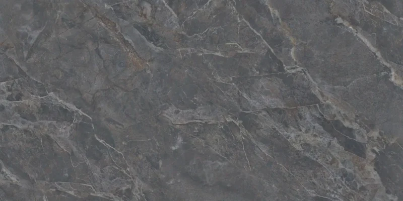


Countertop colour has a direct influence on how heavy or open a black kitchen feels. The strongest decision is usually not “which colour matches black?” but “how much separation should exist between the cabinets and countertop?”
| Countertop Colour | Typical Effect | Best Used When |
|---|---|---|
| Bright White | Maximum contrast and clearer visual separation | The room needs brightness or a crisp architectural palette |
| White with Grey Veining | High contrast with added movement | The countertop should become a visual feature |
| Light Grey | Softer transition between black and light finishes | A less graphic contrast is preferred |
| Warm Beige / Cream | Introduces warmth and reduces visual severity | Wood flooring or warm metals are present |
| Greige / Taupe | Neutral, transitional contrast | The kitchen combines warm and cool finishes |
| Concrete-Look Grey | Architectural and industrial | Flat-panel cabinetry and minimal detailing are used |
| Charcoal / Black | Low-contrast, continuous dark palette | The kitchen is large, well lit and intentionally dramatic |
Bright white creates the strongest separation from black cabinetry. It can be especially useful in smaller kitchens or rooms with limited daylight because the countertop becomes a broad reflective surface between darker cabinet elements.
The combination is visually direct, so it works particularly well when the kitchen design relies on clean lines and a limited colour palette.
Veined white surfaces retain the brightness of a light countertop while adding movement and visual depth. This can prevent a black-and-white kitchen from feeling overly flat.
The amount of veining should be coordinated with the rest of the room. Strong movement can serve as the main design feature, while subtler veining is easier to combine with patterned flooring or more decorative backsplashes.
Light grey reduces the sharp transition between black and white. It can work well when homeowners want contrast without creating a highly graphic black-and-white composition.
Grey also pairs naturally with brushed metal, stainless steel and cooler flooring, although the specific undertone should still be checked against the room’s lighting.
Warm neutrals are useful when the kitchen needs to feel less severe. They can connect black cabinetry with oak flooring, brass hardware, warm wall colours or other natural finishes.
Greige and taupe are particularly flexible because they can bridge cool black cabinetry with warmer surrounding materials without appearing obviously beige.
Concrete-inspired grey surfaces work naturally with flat-panel black cabinetry and other architectural finishes. They create less contrast than white stone while maintaining enough tonal separation to define the countertop clearly.
This approach is especially effective when the room uses restrained materials, simple hardware and minimal decorative detailing.
A black countertop with black cabinetry creates the lowest level of contrast and the strongest monochromatic effect. This can be visually powerful, but it requires more careful coordination than a lighter surface.
Lighting, backsplash, flooring and texture become critical because they must create enough separation to prevent the major surfaces from blending into a single dark mass.
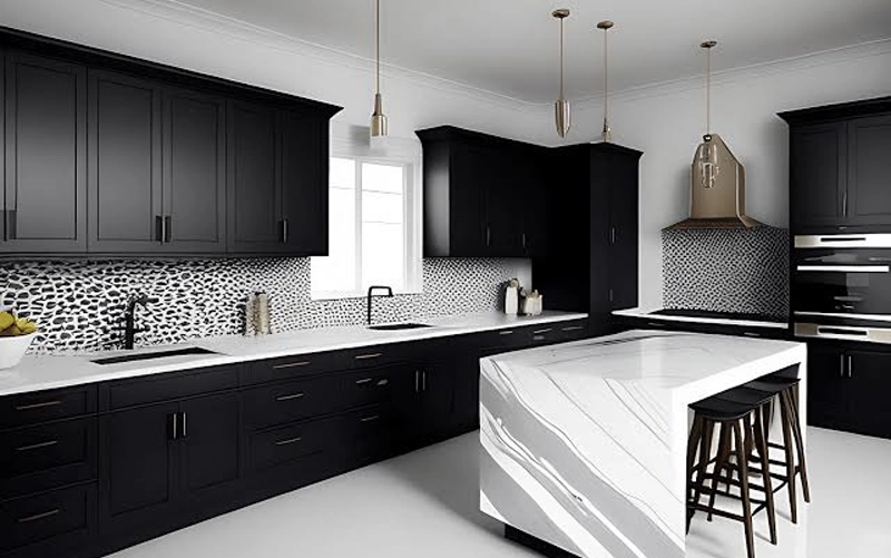
Black cabinetry can appear very different depending on the design language around it. The countertop should reinforce that direction rather than introducing a separate style.
| Kitchen Style | Countertop Direction | Why It Works |
|---|---|---|
| Modern | White or light-grey quartz / porcelain | Creates clean contrast and supports simple cabinet geometry |
| Minimalist | Quiet white, grey or dark solid-look surface | Limits visual noise and emphasizes form |
| Transitional | Softly veined white, greige or restrained natural stone | Balances classic and contemporary elements |
| Warm Contemporary | Cream, warm white or taupe stone | Softens black cabinetry and connects with wood or brass |
| Industrial | Concrete-look grey or dark porcelain | Reinforces an architectural, material-driven palette |
| Natural / Organic | Granite or warm natural stone with moderate movement | Introduces texture beside the solid cabinet colour |
| Feature-Led | Expressive quartzite or marble | Black cabinetry provides a quiet backdrop for dramatic slab movement |
Modern kitchens generally benefit from clear geometry and controlled pattern. White or pale grey quartz and porcelain can create crisp separation from flat-panel cabinetry without introducing excessive visual movement.
Warm contemporary designs often combine black cabinetry with wood flooring, warm metals or natural textures. Cream, taupe and warmer white stone can bridge those materials more naturally than a very cool white.
Concrete-inspired porcelain, grey stone and darker surfaces can reinforce the material-driven character of an industrial kitchen. Here, texture and tonal variation often matter more than sharp contrast.
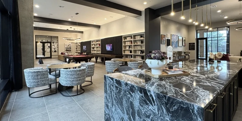
If the countertop is intended to become the primary visual feature, black cabinetry can provide an effective background for expressive marble or quartzite. Large islands are particularly suited to this approach because they provide enough uninterrupted surface area for natural movement to read clearly.
Design Rule: Let one element lead. If the stone has dramatic movement, keep the backsplash and surrounding finishes quieter. If the countertop is restrained, other materials can carry more texture without making the kitchen feel visually crowded.
Black cabinets can support both light and dark countertops, but the two approaches create very different results.
Light countertops create clearer separation from the cabinetry and can help the kitchen feel brighter. They are especially useful in compact spaces, kitchens with limited daylight, or rooms where the cabinetry already occupies a large visual area.
Dark countertops create a more continuous and dramatic palette. This approach can work well in larger kitchens with strong natural or layered artificial lighting, especially when the backsplash or flooring introduces enough contrast to keep the major surfaces visually distinct.
| Approach | Effect | Often Works Best When |
|---|---|---|
| Light Countertop | Brighter, clearer contrast | The room needs more visual separation or reflected light |
| Mid-Tone Countertop | Softer transition | The design combines warm and cool finishes |
| Dark Countertop | Continuous, dramatic palette | The room is spacious and well lit |
Black cabinets and the countertop should be evaluated alongside the flooring and backsplash rather than as an isolated pair.
Warm wood flooring can soften black cabinetry and works naturally with warm white, cream, greige and many natural stone surfaces. Cooler grey flooring tends to support crisp white, light grey or concrete-inspired countertops.
The backsplash should also respect the amount of pattern already present. If the countertop has strong veining, a restrained backsplash can preserve visual hierarchy. If the countertop is quiet, the backsplash can introduce more texture without competing with the cabinetry.
A full-height stone backsplash can reduce the number of competing materials and create a more continuous look. Teccorp Stone’s Kitchen Stone Backsplash service can be considered when the countertop material is intended to continue vertically.
Hardware should support the overall material palette rather than determine the countertop by itself.
Warm metals such as brass can introduce warmth beside black cabinetry and work well with cream, warm white, taupe and many naturally veined stones. Brushed nickel, stainless steel and chrome often integrate easily with cooler white or grey surfaces. Matte black hardware creates a more continuous cabinet appearance and can allow the countertop to provide the primary contrast.
The best result usually comes from coordinating countertop, hardware, fixtures and lighting as one system rather than matching each finish independently.
Surface finish changes the way the countertop interacts with black cabinetry.
A polished finish reflects more light and can help create greater visual separation in a dark kitchen. It also tends to emphasize colour and natural movement.
A honed or matte finish produces a softer, more architectural effect and often pairs naturally with matte black or flat-panel cabinetry.
Availability, appearance and care requirements vary by material and product, so the finish should be confirmed for the specific quartz, granite, marble, quartzite or porcelain surface being considered.
Final Design Check: View the countertop beside the actual cabinet finish, flooring and backsplash under the lighting conditions of the room before approving the final surface.
Once you have narrowed the options, compare the finalists against the complete kitchen.
If you are still comparing materials more broadly, our How to Choose the Right Kitchen Countertop guide covers the general selection process. This page should remain focused specifically on coordinating countertops with black cabinetry.
White, light grey, greige and warm neutral surfaces are versatile choices because they create clear separation from black cabinetry. Darker countertops can also work when the room has sufficient light and the overall design intentionally uses a low-contrast palette.
Yes. White countertops create the strongest contrast and can help visually brighten a kitchen with black cabinetry. Veined white surfaces add movement while preserving that contrast.
Yes. A dark-on-dark combination can create a strong architectural look, but lighting, flooring, backsplash and texture should provide enough separation to prevent the room from feeling visually flat.
Yes. Quartz is available in a wide range of whites, greys, warm neutrals and darker patterns, making it easy to control the amount of contrast. Care should follow the recommendations for the specific product selected.
Not necessarily. Lighter surfaces are useful when brightness and contrast are priorities, while mid-tone or dark countertops can work well in larger, well-lit kitchens where a more continuous palette is desired.
If the countertop already contains strong movement, a quieter backsplash often creates better balance. A matching full-height stone backsplash can also create continuity when carefully planned with the countertop layout.
The best kitchen countertops for black cabinets are the surfaces that balance the cabinetry’s visual weight with the right amount of contrast, pattern and warmth for the room.
Quartz can provide controlled colour and pattern, granite can introduce natural texture, quartzite and marble can create stronger natural movement, and porcelain can support a more architectural design direction. The best choice depends on the lighting, flooring, backsplash, cabinet finish and everyday requirements of the kitchen.
Explore Teccorp Stone’s Stone Surfaces or review material options through our Kitchen Countertops service.
Find the Right Stone for Your Black Kitchen
Compare countertop colours, materials and finishes before finalizing your black cabinetry design.