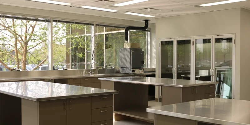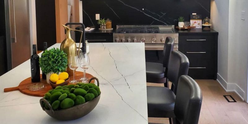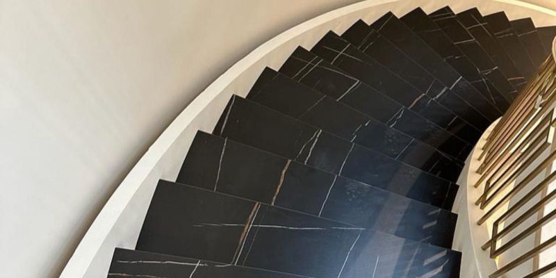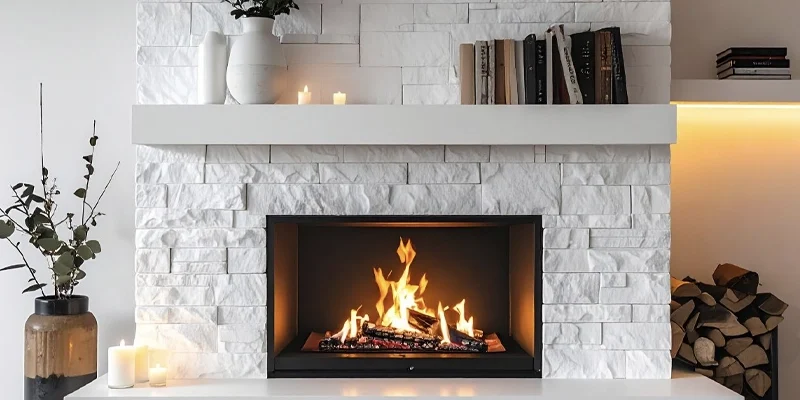
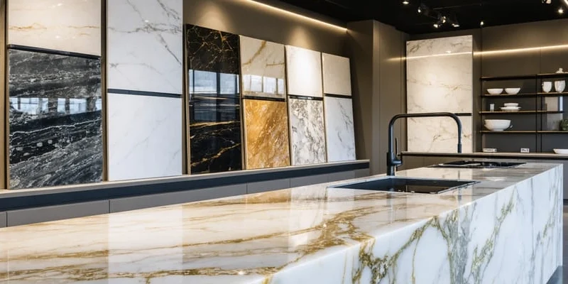
Quartz countertop colours and patterns should be selected as part of the complete kitchen palette—not compared as isolated samples. Cabinet finishes, flooring, backsplash materials, lighting and the amount of visible countertop can all change how a quartz design appears in the completed room.
TecCorp Stone supports quartz countertop projects across Toronto and the GTA involving compact kitchens, open-concept layouts, large islands, waterfall panels and slab backsplashes. A subtle quartz may provide a controlled background, while a strongly veined design can become the main visual feature of the kitchen.
This guide explains how to compare quartz colour undertones, pattern scale and visual movement before selecting the final product. It focuses on design compatibility rather than brand quality, slab allocation or seam planning.
Begin with the Kitchen, Not the Sample
Define the cabinet, flooring and backsplash direction before deciding whether the quartz should blend quietly or become the main visual feature.
The quartz should have a clear role within the kitchen design. It may connect the surrounding finishes quietly, create controlled contrast or become the strongest pattern in the room.
Selecting this role first helps reduce the number of unsuitable samples and prevents several dominant materials from competing with one another.
A quiet quartz design may suit a kitchen where the cabinets, backsplash, flooring or architectural details already create visual interest.
These products often use:
A feature quartz design may be more appropriate when the surrounding finishes are simple and the countertop is expected to provide the main movement.
Statement surfaces may use:
Neither approach is automatically more contemporary or more valuable. The better choice is the one that creates the intended relationship with the complete room.
The same quartz pattern can produce different results depending on the amount and location of the material.
A bold design used only on narrow perimeter counters may appear controlled. The same product used on a large island, two waterfall panels and a full-height backsplash may dominate the kitchen.
Before comparing patterns, estimate where quartz will appear:
The greater the visible area, the more important pattern scale and repetition become.
Quartz should be reviewed with the main finishes that will remain visible after the renovation.
Bring or collect samples of:
The objective is not to make every finish the same colour. The materials should relate through undertone, contrast and visual weight.
A kitchen with highly figured wood cabinets may benefit from a calmer quartz design. Flat-panel cabinets in a restrained colour may support a more expressive countertop.
Two quartz surfaces may both be described as white, grey or beige while appearing noticeably different beside the same cabinet.
The difference often comes from the undertone—the warmer, cooler or more neutral colour influence beneath the main background.
Warm quartz may contain cream, beige, taupe, soft brown or warm grey influences.
These undertones can relate naturally to:
Warm quartz does not need to look yellow. The undertone may be subtle and become visible only when the sample is placed beside a cooler material.
Cool quartz may include blue-grey, crisp white, charcoal or cooler grey influences.
These surfaces can work with:
A cool quartz background placed beside warm cream cabinetry may make both materials appear more different than expected.
Some quartz products sit between clearly warm and clearly cool directions. These balanced backgrounds may be useful when the kitchen contains several existing finishes that need to remain.
Neutral does not mean colourless. The sample should still be compared with the actual cabinet and flooring materials to confirm that it does not shift unexpectedly under the room lighting.
White is not one fixed colour. A cabinet may appear crisp and neutral until it is placed beside a cooler quartz, making the cabinet look creamier. A warm quartz may make the same cabinet appear comparatively grey.
When both the cabinets and countertop are light:
A slight difference can look intentional when the undertones relate. An unplanned near-match may appear less controlled than a clearer contrast.
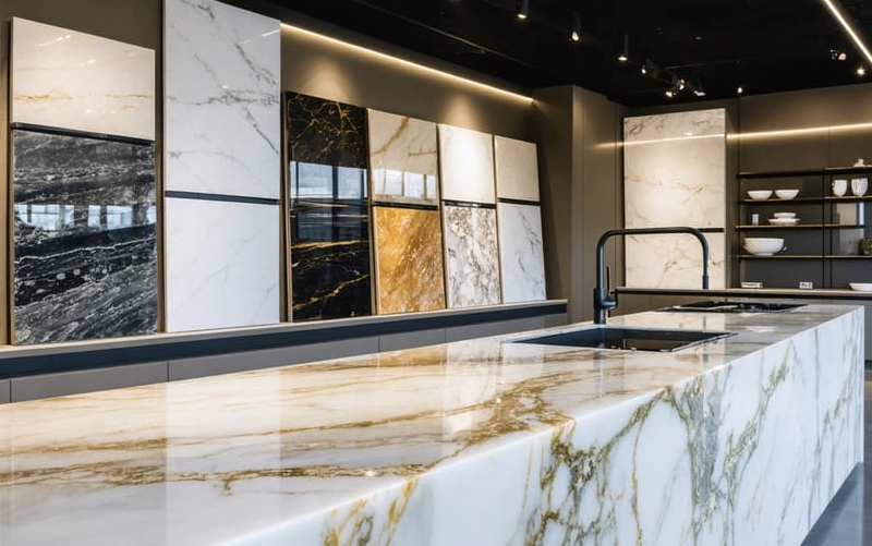
Pattern scale describes how large, frequent and visually dominant the movement appears across the quartz surface.
A hand sample may show one vein or cluster without explaining how often that feature repeats across the full slab. The scale should therefore be considered in relation to the size of the visible countertop.
Fine patterns may use small particles, soft movement or closely controlled markings.
They can support:
A fine pattern may also make transitions between separate countertop areas less visually dominant, although seam planning remains a separate fabrication decision.
Medium-scale patterns provide more visible character without necessarily becoming the main feature.
They may suit kitchens that need:
The exact result depends on contrast as well as scale. A medium pattern with strong dark movement may appear more dominant than a larger pattern with soft tonal differences.
Broad veining can create a feature-slab appearance across islands, waterfall panels and full-height backsplashes.
Before choosing a strongly patterned quartz, consider:
The visual style can be selected at this stage, but the exact distribution of veins between fabricated pieces belongs to the separate seam-and-layout review.
Two quartz products may contain similar vein colours but create very different results because of the amount of open background between them.
Greater negative space can make individual veins feel more prominent. Denser movement may create a more continuous texture across the countertop.
Review both:
The pattern should be judged at both sample distance and normal room-viewing distance before the design direction is finalized.
Lighting can change how a quartz background, vein colour and surface finish appear. A sample that looks balanced under showroom lighting may appear warmer, cooler or more reflective inside the kitchen.
Quartz should therefore be reviewed under the main lighting conditions that will affect the installed countertop.
Natural light can reveal undertones that are less visible under artificial lighting. The direction and amount of daylight may also change throughout the day.
When possible, place the sample:
A cool white quartz may appear brighter in a naturally lit kitchen, while warm cream or beige influences may become more visible in lower daylight.
Warm lighting can emphasize cream, beige and brown undertones. Cooler lighting may strengthen grey, blue or crisp-white influences.
The sample should be checked under:
Lighting should not be selected only to correct an unsuitable material combination. The quartz and surrounding finishes should already relate before the final lighting temperature is chosen.
Quartz may appear different when viewed flat on a countertop and vertically on a waterfall panel or backsplash.
Horizontal surfaces reflect ceiling and window light, while vertical sections interact more directly with cabinetry, wall finishes and nearby fixtures.
When the project includes vertical quartz, test the sample in both positions. This provides a more realistic preview of how the colour and pattern will behave across the complete design.
Check the Sample More Than Once
Review the quartz during daytime and evening conditions before approving the colour direction.
Cabinets usually occupy more visible area than the countertops, making them one of the most important references for quartz selection.
The quartz can coordinate closely with the cabinetry, create a deliberate contrast or connect the cabinets with other finishes in the room.
White cabinets allow many quartz directions, but near-matching light surfaces require careful undertone review.
Possible approaches include:
When two light finishes almost match but have conflicting undertones, the difference may appear accidental. A clearer contrast can sometimes look more deliberate than an unsuccessful near-match.
Wood cabinetry already contains grain, colour variation and natural movement.

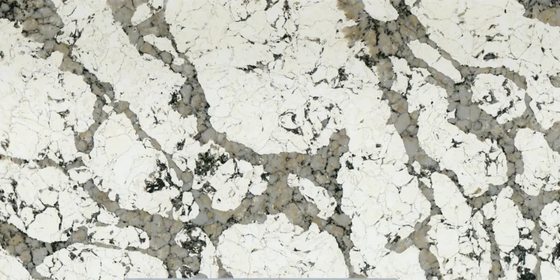

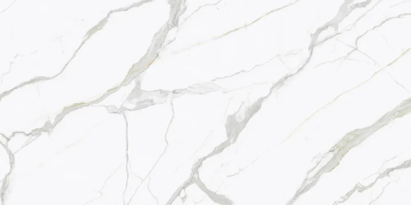
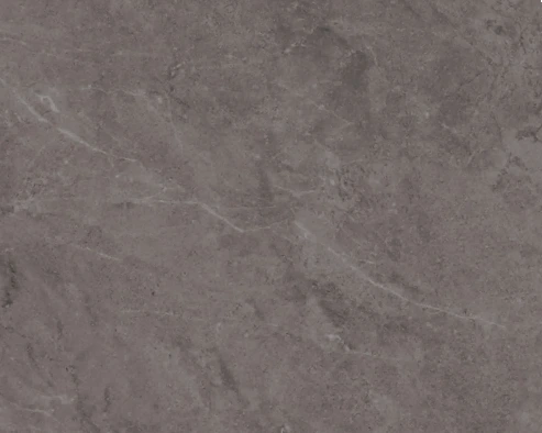






Warm oak, walnut and similar finishes may coordinate with:
A quieter quartz often allows the wood grain to remain the main feature. Strong veining can still work when the cabinetry has a simple profile and the other finishes are restrained.
Dark blue, green, charcoal or black cabinetry can support either a contrasting light quartz or a more tonal, dramatic combination.
A light countertop may:
A darker quartz can create a more continuous and architectural result, but lighting, room size and flooring should be reviewed carefully.
The colour relationship should also be checked at cabinet height rather than relying only on separate showroom samples.
Quartz is only one part of the visible kitchen palette. Flooring, backsplash materials and hardware can either support the countertop or introduce competing colour and pattern directions.
When the quartz contains strong movement, a quieter backsplash and flooring may create better balance.
When the backsplash is highly decorative, the countertop may need to remain more controlled.
Potential pattern competition can occur between:
The goal is not to remove all visual variation. One or two elements should lead while the others provide support.
The finishes do not need to match exactly, but their warm, cool or neutral directions should relate intentionally.
A useful comparison should consider:
A quartz sample may coordinate with the cabinets but conflict with flooring that covers a much larger area. The complete room should therefore be reviewed before the selection is finalized.
Contrast can help define the countertop and prevent the kitchen from appearing flat.
Examples include:
Contrast should be repeated or supported elsewhere in the kitchen so that it feels deliberate rather than isolated.
Review the kitchen stone backsplash service when the project includes a coordinated quartz backsplash or another vertical slab surface.
The island and perimeter countertops can use the same quartz or follow different visual directions. The decision should reflect the size of the kitchen, the role of the island and the number of other visible finishes.
Using one quartz design can create a unified result and simplify the overall palette.
This approach may work well when:
The complete visible area should still be considered. A pattern that looks controlled on a sample may become much stronger when repeated across the entire kitchen.
A feature island can use a stronger quartz design while the perimeter remains quieter.
The two surfaces should relate through at least one shared characteristic, such as:
Using two quartz products adds another visual decision and may also affect material ordering. The combination should be reviewed as a complete composition rather than as two separate samples.
A quartz backsplash increases the visible amount of the selected design. Strong movement may become more dominant when it appears on both horizontal and vertical surfaces.
Before approving the combination, review:
This stage determines the visual direction only. The exact positioning of veins between countertops, waterfalls and backsplashes should be completed separately during fabrication-layout approval.
Review the kitchen island countertop service when comparing a feature island, waterfall panels or coordinated perimeter surfaces.
A quartz sample can confirm the general colour and finish, but it may not show how the complete design behaves across an island, long countertop run or vertical backsplash.
Before approving the product, review a full slab or an accurate full-slab image whenever possible.
A small sample may not show:
This is particularly important for strongly veined quartz. A sample taken from a quiet section may create a different expectation from the complete slab.
Online photographs also have limitations. Screen settings, image editing and surrounding colours may change the apparent undertone and contrast.
View the design both close up and from a normal room-viewing distance.
From farther away, consider:
A pattern that looks dramatic on a sample may appear more balanced across a complete slab. The opposite can also occur when several broad veins become visible together.
Choosing the colour and pattern confirms the design direction. It does not determine which part of the slab will appear on the island, where seams will be located or how veins will relate between separate pieces.
Those decisions should be completed during slab and fabrication-layout approval.
This separation protects the intent of the design decision. First confirm that the overall quartz style suits the kitchen; then review how the actual material will be allocated.
Approve the Design before Approving the Layout
Colour and pattern selection establishes the visual direction. Exact slab allocation, seams and vein relationships require a separate fabrication review.
Common selection mistakes include:
The most dependable approach is to compare the quartz within the complete room and define which material should lead the design.
| Design Direction | May Suit | Review Carefully |
|---|---|---|
| Warm, quiet background | Cream cabinets, warm woods and traditional palettes | Yellow or beige shifts under artificial light |
| Cool, crisp background | Cool whites, greys and contemporary cabinetry | Contrast with warm flooring or cream finishes |
| Fine, low-contrast pattern | Compact kitchens and rooms with decorative finishes | Whether the result becomes too visually flat |
| Medium movement | Balanced kitchens needing controlled visual interest | Pattern competition with flooring and backsplash |
| Broad statement veining | Large islands, simple cabinets and feature surfaces | Total visible area and later fabrication layout |
Visual Role
The quartz has been defined as a quiet background, controlled contrast or main feature.
Undertone
Warm, cool or neutral influences have been compared with the cabinets and flooring.
Pattern Scale
The movement suits the size and total visible area of the kitchen.
Lighting Review
The sample has been checked during daytime and evening conditions.
Complete Palette
Cabinets, flooring, backsplash and metal finishes have been reviewed together.
Full Design
A full slab or accurate full-slab image has been reviewed before final approval.
The suitable colour depends on the undertone of the cabinets. Compare warm, cool and neutral quartz samples directly beside the cabinet finish.
Not necessarily. The quartz may coordinate closely or create deliberate contrast. An intentional contrast can look more controlled than an unsuccessful near-match.
They can, but the visible area and surrounding finishes should remain balanced. A bold pattern may work when cabinetry and flooring are restrained.
They may use one coordinated product or different surfaces. When two products are used, they should share an undertone, accent colour or other visual connection.
Yes. Natural light, warm bulbs, cool bulbs and under-cabinet lighting can change the apparent colour and contrast.
Strong movement requires closer review of pattern scale and surrounding finishes. Exact vein placement is handled later during fabrication-layout planning.
Yes, particularly for broad or directional patterns. A small sample cannot show the complete scale and distribution of movement.
Yes. The total visible pattern should be reviewed because using the same quartz vertically can make the design more dominant.
The right quartz design connects colour, undertone and pattern scale with the cabinets, flooring, backsplash, lighting and amount of visible countertop.
Before final approval, compare the material inside the kitchen, review the full design and confirm whether it should support the room quietly or become its main feature.
Comparing Quartz Countertop Colours?
Share your cabinet, flooring and backsplash direction to compare quartz products within the complete kitchen palette.