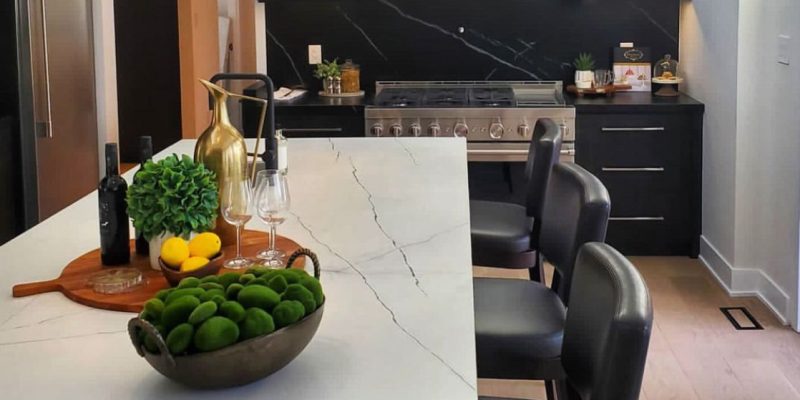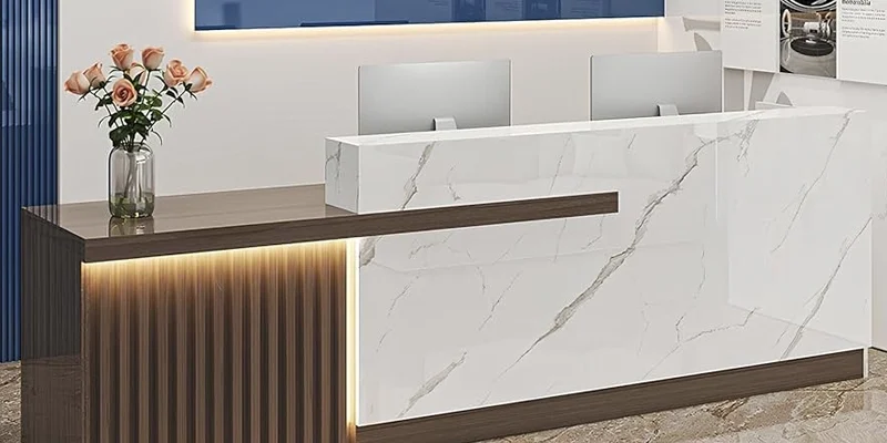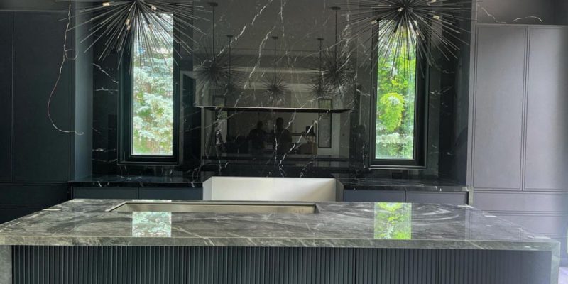
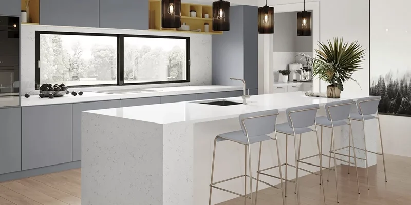
Choosing the best kitchen countertops for white cabinets is less about finding a surface that simply “matches” white and more about deciding what role the countertop should play in the room. White cabinetry can act as a quiet background for dramatic natural stone, support a soft tonal palette, or create strong contrast with darker surfaces.
The challenge is that not every white cabinet is actually the same white. Some finishes have warm cream undertones, others lean cool or slightly grey, and the appearance can change considerably under different lighting. Countertop colour, veining, finish and surrounding materials therefore need to be evaluated together.
This guide compares quartz, granite, quartzite, marble and porcelain with white cabinetry while explaining how contrast, undertones, cabinet style, flooring and backsplash affect the final result. The goal is not to identify one universal “best” surface, but to help you choose a countertop that works with the specific white cabinetry and design language of your kitchen.
Design Principle: White cabinetry gives you considerable flexibility, but that does not mean every countertop works equally well. Start by identifying the cabinet undertone and deciding whether you want the countertop to blend, contrast or become the primary focal point.
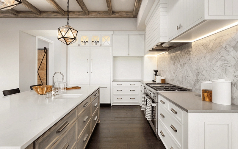
White cabinets work with every major countertop category, but each material creates a different relationship between colour, pattern and texture.
| Material | Typical Effect with White Cabinets | Key Consideration | Often Suits |
|---|---|---|---|
| Quartz | Controlled, clean and highly adaptable | Coordinate the quartz undertone with the cabinet white | Modern, transitional and everyday kitchens |
| Granite | Natural texture and stronger visual contrast | Review full-slab colour variation | Natural, transitional and traditional kitchens |
| Quartzite | Expressive natural movement | Vein direction and slab layout become important | Feature islands and design-led kitchens |
| Marble | Soft tonal layering or natural contrast | Natural variation and care expectations | Classic and statement kitchens |
| Porcelain | Clean, architectural and controlled | Product-specific fabrication details | Contemporary and minimalist kitchens |
White cabinets create a flexible starting point, but successful combinations still depend on undertone, contrast, pattern and the surrounding materials.
Cabinet whites can lean warm, cool or neutral. A warm white may contain cream or subtle yellow undertones, while cooler whites can appear slightly blue or grey.
This distinction matters because two pale surfaces can look mismatched even when both are described as “white.” For example, a very cool countertop beside warm cabinetry may make the cabinets appear unexpectedly yellow.
Rather than matching colour names, compare the actual cabinet finish and countertop sample under the lighting conditions of the room.
White cabinetry can support several levels of contrast.
Low contrast uses white, off-white or softly veined countertops to create a continuous and bright composition.
Medium contrast introduces grey, greige, beige or more visible veining while keeping the kitchen relatively light.
High contrast pairs white cabinets with charcoal, black or strongly coloured natural stone, allowing the countertop to become a clear architectural feature.
| Contrast Level | Countertop Direction | Typical Result |
|---|---|---|
| Low | White / off-white / subtle veining | Bright, continuous and restrained |
| Medium | Grey / greige / beige / stronger veining | Balanced separation and added depth |
| High | Charcoal / black / dramatic stone | Strong focal contrast |
Cabinet profile affects how much visual movement the countertop can comfortably carry.
Flat-panel white cabinetry generally supports stronger stone patterns because the cabinet surface itself is visually quiet. Shaker cabinets introduce more detail and often pair naturally with moderate veining or simpler stone patterns. Traditional cabinetry with mouldings and decorative hardware may benefit from a more restrained countertop so the room does not become overly busy.
White cabinetry reflects surrounding light, so the same countertop can appear noticeably warmer or cooler depending on the room.
Wood flooring often supports warmer white, cream, beige and natural stone tones. Cooler grey flooring can work naturally with crisp white, grey or darker countertops.
The backsplash should also be considered before the stone is finalized. If the countertop already contains strong movement, keeping the backsplash quieter generally produces better visual hierarchy.
Design Check: When using a light countertop with white cabinets, compare the undertones carefully. Tonal kitchens work best when the whites relate intentionally rather than appearing almost—but not quite—the same.
Quartz countertops offer considerable flexibility with white cabinetry because the material is available in tonal whites, warm neutrals, greys, darker colours and a wide range of veined patterns.
A white quartz can create a bright, continuous palette, but undertone coordination is important. Warm white cabinets usually pair more naturally with softer or warmer quartz tones, while cooler cabinetry can support crisp whites and cooler greys.
Veined quartz can introduce movement without abandoning the overall brightness of the kitchen. Darker quartz produces the opposite effect, using the countertop as a defined contrast against the cabinetry.
Many quartz products are nonporous and generally do not require routine sealing. Heat exposure and cleaning recommendations should still follow the guidance for the specific product selected.
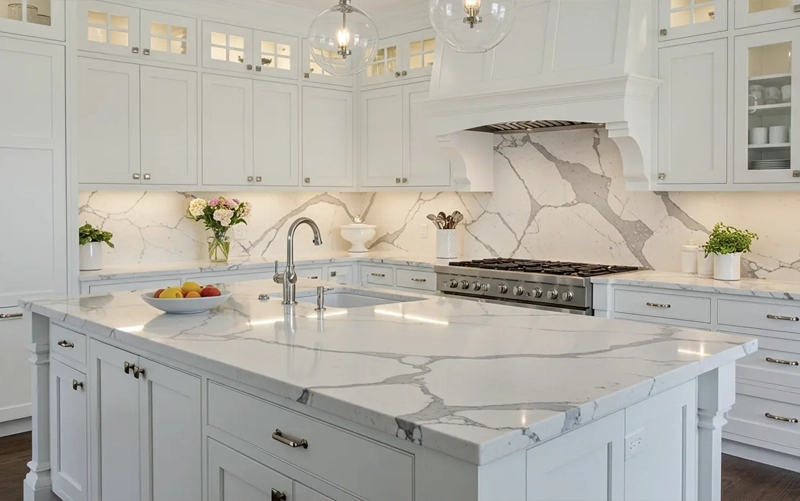
Granite countertops can introduce natural depth and mineral variation into a kitchen where white cabinetry otherwise creates a relatively uniform background.
Lighter granite can preserve an open, bright palette while adding more texture than a solid or lightly patterned engineered surface. Mid-tone and darker granite create greater separation from the cabinetry and can make the countertop a stronger visual feature.
Because granite is natural stone, the full slab should be reviewed whenever possible. Colour distribution, mineral patterns and movement can vary considerably across the surface, and those characteristics may appear more pronounced beside clean white cabinetry.
Maintenance requirements, including whether sealing is appropriate, should be based on the selected stone and finish rather than a fixed schedule applied to every granite surface.
Quartzite countertops can be particularly effective with white cabinetry when the stone is intended to become the primary visual feature of the kitchen.
White cabinets provide a relatively neutral background for natural veining, allowing expressive quartzite slabs to remain visually prominent without competing with strong cabinet colour or grain.
Light quartzite can maintain an airy palette while adding natural movement. Slabs with stronger grey, taupe or darker veining can create greater depth and make islands or long countertop runs more visually distinctive.
For projects using prominent natural movement, reviewing slab orientation before fabrication can help coordinate vein direction across islands, waterfalls and adjoining sections.
Marble countertops can create either a soft tonal composition or stronger natural contrast depending on the colour and veining of the selected slab.
White marble with subtle movement can preserve the brightness of white cabinetry while introducing enough variation to prevent the kitchen from appearing visually flat. Stronger veining creates a more expressive focal surface while the cabinetry remains comparatively quiet.
Marble should be selected with realistic expectations about use and care. Acidic substances can etch calcium-based stone, and natural variation or gradual patina may become part of the surface over time.
Porcelain countertops can support a clean contemporary palette with white cabinetry, particularly when the design calls for controlled pattern and large-format surfaces.
White or marble-inspired porcelain can create a continuous light composition, while grey, concrete-inspired or darker designs introduce stronger contrast without changing the streamlined character of the room.
Because porcelain slab systems differ in thickness, construction and fabrication requirements, edge details, cutouts and installation methods should be planned for the specific product selected.
Material Strategy: White cabinets already provide a neutral backdrop. Choose the countertop material based on how much natural movement, contrast and visual texture you want to introduce—not simply on whether the surface is light or dark.
White cabinetry offers one of the widest countertop colour ranges, but the choice still affects how bright, warm, dramatic or architectural the finished kitchen feels.
| Countertop Colour | Typical Effect | Best Used When |
|---|---|---|
| White / Off-White | Bright, tonal and continuous | A light, restrained palette is the goal |
| White with Veining | Maintains brightness while adding movement | The countertop should add visual interest without becoming dark |
| Light / Mid Grey | Moderate, contemporary contrast | The room includes cooler flooring or metallic finishes |
| Greige / Beige | Adds warmth and softens the white palette | Wood flooring or warm finishes are present |
| Charcoal / Black | Strong architectural contrast | The countertop should clearly define the work surface |
| Expressive Natural Stone | Creates a feature surface against a quiet background | The slab is intended to become a focal point |
White-on-white kitchens can feel open and visually calm, but undertones need careful coordination. A warm off-white surface may sit naturally beside creamier cabinetry, while crisp white stone may work better with cooler cabinet finishes.
The goal does not need to be an exact match. Slight tonal variation can add depth, provided the two whites appear intentional under the actual room lighting.
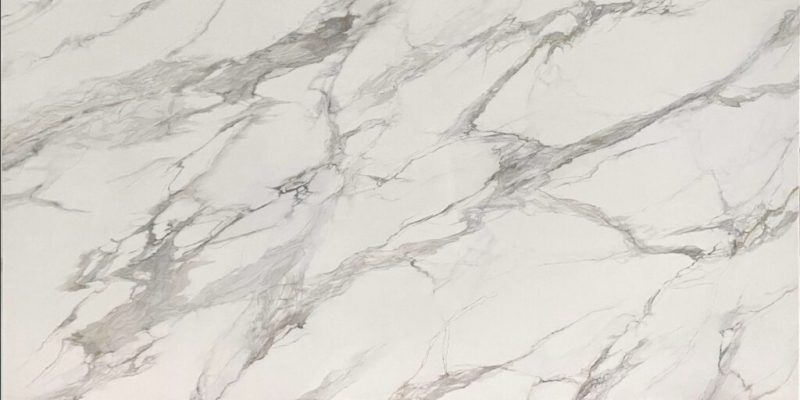
Veining is one of the easiest ways to add visual interest without losing the brightness associated with white cabinetry.
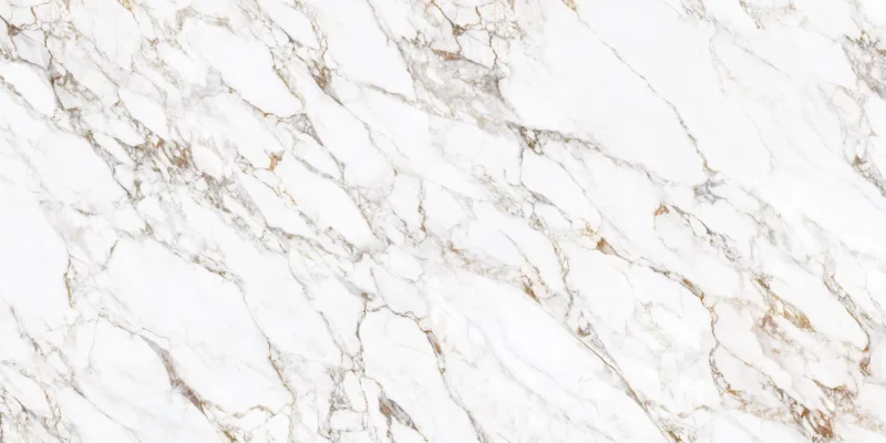
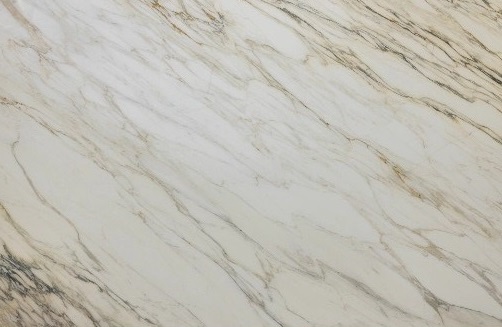
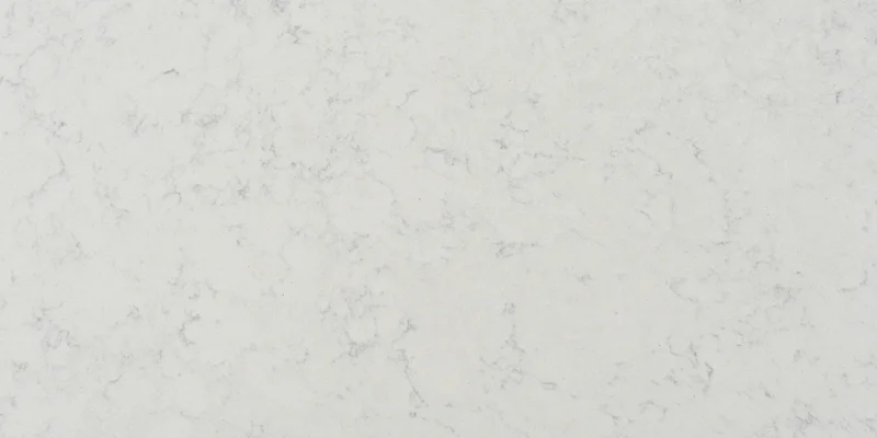
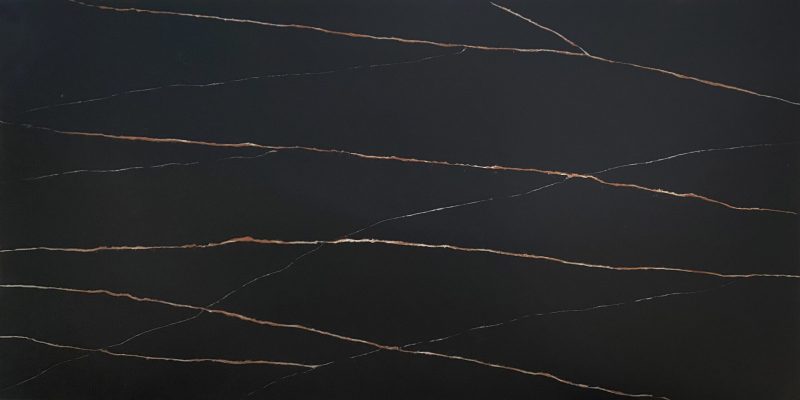

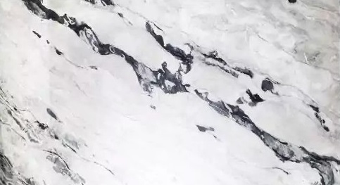
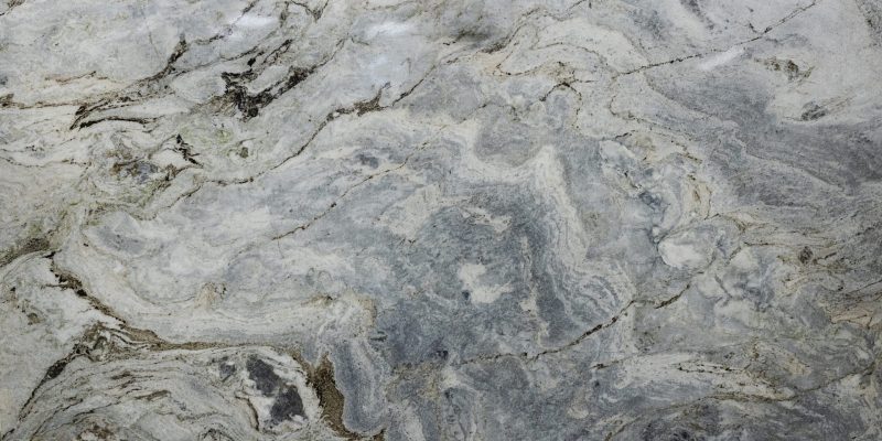



Grey creates more separation than a tonal white surface without producing the dramatic contrast of black. Light and mid-grey options can work especially well with stainless steel, cooler flooring and contemporary white cabinetry.
Warm neutrals help connect white cabinetry with wood flooring, brass hardware and warmer interior finishes. Greige can be particularly useful when the kitchen includes both warm and cool elements because it sits between traditional beige and cooler grey.
Dark countertops create the strongest visual separation from white cabinetry. The contrast can emphasize cabinet geometry and give islands or perimeter countertops greater architectural definition.
For homeowners considering the opposite cabinet-and-countertop relationship, our Best Kitchen Countertops for Black Cabinets guide explores how stone colours behave when the cabinetry becomes the darker element.
White cabinetry can also act as a quiet backdrop for strongly patterned marble, quartzite or granite. This approach works particularly well on large islands where enough uninterrupted slab area is visible for the natural movement to become a deliberate design feature.
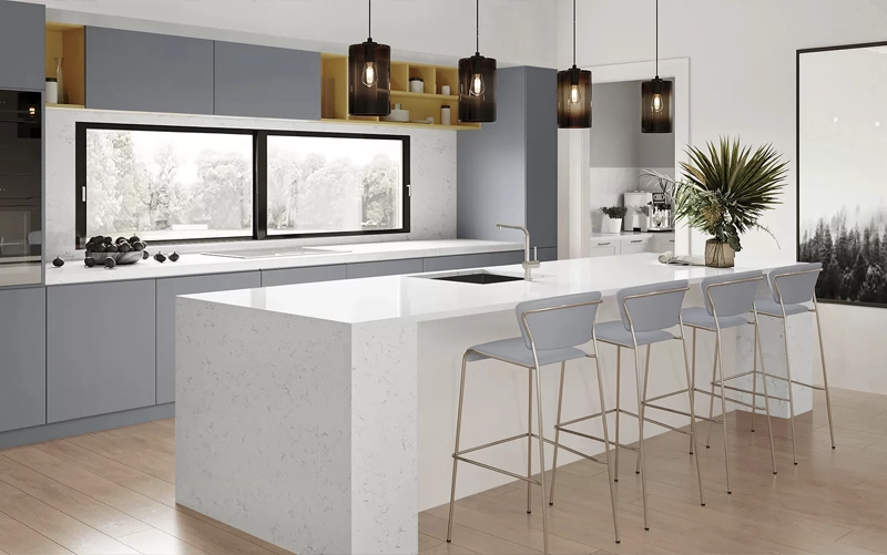
Cabinet style influences how much pattern and contrast the countertop can comfortably carry.
| Cabinet Style | Countertop Direction | Why It Works |
|---|---|---|
| Flat-Panel / Modern | Tonal quartz, porcelain or expressive natural stone | Simple cabinetry can support either minimal or dramatic stone |
| Shaker | Softly veined white, greige, grey or restrained natural stone | Balances cabinet detail with controlled countertop movement |
| Traditional | Marble, granite or warmer neutral surfaces | Natural texture complements more detailed cabinetry |
| Minimalist | Quiet white, light grey or strong monochrome contrast | Keeps the number of competing visual elements low |
| Warm Transitional | Cream, greige or warm-veined stone | Connects white cabinetry with wood and warm metals |
Flat-panel white cabinetry provides a quiet background that can support both restrained surfaces and stronger natural veining. The choice depends largely on whether the countertop or cabinet geometry should become the primary visual feature.
Shaker cabinetry already introduces visible panel detail. Softly veined quartz, restrained granite, greige and medium-contrast surfaces often work well because they add depth without competing with the cabinet profile.
More decorative cabinetry can pair naturally with marble, granite and warmer stone palettes, particularly when the surrounding flooring and hardware also reinforce a classic or transitional material language.
For kitchens where the cabinetry itself contributes natural grain rather than a painted finish, see our Best Kitchen Countertops for Wood Cabinets guide.
Design Rule: The simpler the cabinetry, the more visual movement the countertop can usually carry. As cabinet detailing, flooring pattern and backsplash texture increase, a quieter stone surface often creates better balance.
White cabinetry can support both light and dark countertops, but each approach changes the visual structure of the kitchen.
Light countertops create a softer, more continuous palette. White, off-white and pale neutral surfaces can make cabinetry and countertop read as one bright composition, particularly when undertones are coordinated carefully.
Dark countertops create stronger separation and define the work surface more clearly. Charcoal, black and deeper natural stone can be especially effective when the kitchen needs greater visual contrast or when the island is intended to become a focal point.
| Approach | Typical Effect | Best Considered When |
|---|---|---|
| Light / Tonal | Bright, calm and visually continuous | The goal is an open, restrained palette |
| Mid-Tone | Moderate contrast and added depth | The kitchen combines warm and cool finishes |
| Dark | Strong architectural separation | The countertop should become visually prominent |
White cabinetry is highly responsive to surrounding materials, so flooring and backsplash should be reviewed before the countertop is finalized.
Wood flooring can introduce warmth into an otherwise pale kitchen and often works naturally with warm white, cream, greige and softly veined stone. Grey or cooler flooring can support crisp whites, light greys and stronger black-and-white contrast.
The backsplash should respond to the amount of pattern already present in the countertop. When the stone has dramatic veining, a simpler backsplash usually preserves a clearer visual hierarchy. With a quieter countertop, the backsplash can carry more texture or pattern.
A full-height stone backsplash can also continue the countertop vertically and reduce the number of competing materials. Teccorp Stone’s Kitchen Stone Backsplash service can support projects using this approach.
Finish influences how much light the countertop reflects and how strongly it contrasts with white cabinetry.
A polished finish can increase brightness and emphasize the colour or movement of natural stone. A honed or matte finish creates a softer, less reflective relationship and can work particularly well with contemporary or flat-panel cabinetry.
Not every material or product behaves the same way across different finishes, so appearance and care requirements should be confirmed for the specific surface selected.
Final Design Check: Compare the cabinet finish, countertop, flooring and backsplash together under the actual room lighting before approving the final combination.
Once you have narrowed the countertop options, evaluate them as part of the complete kitchen rather than continuing to compare materials in isolation.
For broader material selection—including practical differences between countertop categories—see our How to Choose the Right Kitchen Countertop guide. This article remains focused specifically on pairing countertops with white cabinetry.
White, off-white, grey, greige and dark surfaces can all work well. The best choice depends on the cabinet undertone, desired contrast, flooring, backsplash and lighting.
There is no fixed rule. Tonal light surfaces create a softer, brighter composition, while darker countertops create stronger separation and make the work surface more visually prominent.
Yes. Quartz provides a wide range of whites, neutrals, greys, darker tones and veined patterns, making it flexible for both low- and high-contrast designs.
Softly veined quartz, restrained granite, greige surfaces and many natural stones can work well. Because Shaker cabinetry already contains visible panel detail, the countertop pattern should be balanced against the rest of the room.
Yes. Black and charcoal countertops create strong architectural contrast and can clearly define islands or perimeter surfaces against white cabinetry.
Introduce controlled contrast through countertop veining, darker stone, flooring, backsplash texture, hardware or natural materials rather than adding strong pattern to every surface.
The best kitchen countertops for white cabinets are those that create the right balance between undertone, contrast, pattern and the surrounding finishes.
Quartz can provide controlled colour and movement, granite can introduce natural texture, quartzite and marble can become stronger visual features, and porcelain can support a cleaner architectural direction. White cabinetry gives each of these materials room to work—but the final choice should still be made in the context of the complete kitchen.
Explore Teccorp Stone’s Stone Surfaces or review options through our Kitchen Countertops service.
Find the Right Stone for Your White Kitchen
Compare countertop materials, colours and finishes for your white cabinetry before finalizing the project.