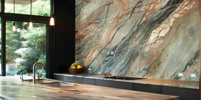


In modern kitchen design, countertops do far more than provide a durable work surface. They shape the atmosphere of the space and subtly influence how a kitchen feels to live in. While material choice and functionality matter, color plays a powerful psychological role—affecting mood, perception, and even long-term satisfaction with a space.
Whether you’re renovating a home in downtown Toronto or designing a custom kitchen elsewhere in Canada, understanding the meaning behind countertop color choices can help you make decisions that feel intentional rather than trendy. Your kitchen countertop is often the largest uninterrupted surface in the room, and its color quietly sets the emotional tone of the entire space.
Color influences how people experience space on a subconscious level. Environmental psychology shows that color can impact appetite, stress levels, focus, and emotional comfort. In kitchens—often the most social and frequently used room in the home—these effects are amplified.
Because countertops visually anchor cabinetry, flooring, and backsplashes, their color carries more influence than many homeowners realize. A well-chosen color can make a kitchen feel open and calming, while the wrong tone can feel overwhelming or dated over time.
White or Off-White Countertops
Black or Charcoal Countertops
Gray Countertops
Earthy Browns and Beiges
Green or Sage Tones
Blue Tones (Navy, Slate, Soft Blue)
Bold or High-Contrast Colors
Lighting dramatically alters how countertop colors appear. Dark tones may feel luxurious in bright, open kitchens but can feel heavy in compact spaces with limited natural light.
| Kitchen Condition | Recommended Countertop Colors |
| Small or enclosed kitchens | Light neutrals, soft whites, pale gray |
| Large open kitchens | Darker tones, charcoal, navy, forest green |
| North-facing kitchens | Warm hues like cream, beige, light brown |
| South-facing kitchens | Cool hues like gray, blue, or black |
For Canadian homeowners, resale considerations still matter. Neutral countertop colors tend to appeal to a wider audience by making kitchens feel clean, bright, and adaptable. White, gray, and soft beige surfaces often photograph better and allow buyers to imagine their own style in the space.
Bolder colors can add personality but may narrow buyer appeal unless paired with a strong overall design concept. The key is balance—expressing individuality without limiting future flexibility.
A countertop color is never just a visual decision. It reflects how you live, what you value, and how you want your home to feel every day. From calming neutrals to expressive tones, the right choice supports both function and emotion.
At TecCorp Stone, we help homeowners choose surfaces that align with both practical needs and personal identity. Because in a well-designed kitchen, the countertop doesn’t just support daily life—it quietly tells your story.