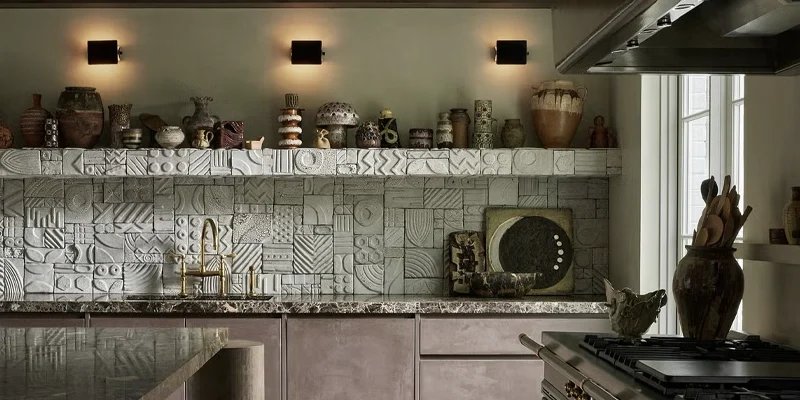
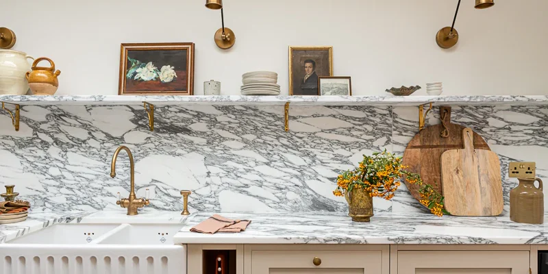
Learning how to match countertops and backsplashes begins with more than finding two materials that share a similar colour. Undertones, pattern scale, surface finish, cabinetry, flooring and kitchen lighting all influence whether the final combination feels coordinated or visually disconnected.
The countertop and backsplash sit directly beside each other, but they do not need to be identical. One surface may act as the focal point while the other provides a quieter background. In other kitchens, the same slab can continue vertically from the countertop to create a unified stone composition. The most successful choice depends on the materials already fixed in the room and the visual role each surface is expected to play.
This guide explains how to compare countertop and backsplash materials as part of one complete kitchen design. It covers colour relationships, undertones, veining, pattern scale, full-height slab applications and the practical details that should be reviewed before a final material is approved.
Matching Overview
Choose the less flexible or more visually dominant material first, confirm that the undertones relate to one another, and allow one surface to lead the design. Exact colour matching is not required, but countertop, backsplash, cabinetry and flooring should appear intentional when viewed together under the kitchen’s actual lighting.
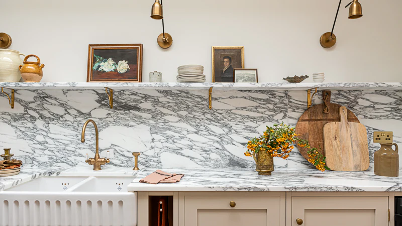
In most kitchen projects, the countertop is selected before the backsplash because it represents a larger surface, has fewer easily interchangeable options and often carries the stronger natural or printed pattern. Once the countertop is confirmed, the backsplash can be chosen to support, continue or deliberately contrast with it.
This is a useful starting point, but it is not an absolute rule. The correct sequence depends on which materials are already fixed and which element is intended to lead the design.
The less flexible material should usually be selected first. This may be a distinctive natural-stone slab, a limited porcelain collection, an existing countertop or a feature backsplash that cannot easily be substituted.
Natural stone slabs are individually patterned, so a particular quartzite, marble or granite selection may establish the colour movement and visual direction for the rest of the kitchen. A backsplash can then be chosen to repeat one of the slab’s quieter tones or provide a controlled contrast.
When the countertop is being replaced as part of a larger project, review available kitchen countertop options before committing to a backsplash colour based only on a small sample.
The backsplash may be selected first when it is intended to become the room’s principal feature. Examples include:
In this situation, the countertop should generally remain more restrained. A quiet surface gives the feature wall enough visual space and reduces competition between patterns.
When the countertop is remaining in place, it becomes the fixed reference point. The backsplash should be reviewed against the actual installed surface rather than a manufacturer’s online image or product name.
Existing countertops may contain several colours that are not obvious from a distance. A backsplash can relate to the dominant background tone, a secondary vein or the cabinetry, but it should not introduce an unrelated undertone simply because both materials are described as white, grey or beige.
Bring backsplash samples into the kitchen and place them vertically against the wall. A sample viewed flat on a table may appear different once it receives vertical light and sits beside the countertop edge.
Two materials can share the same general colour name and still look mismatched. This usually happens because their undertones differ. A warm white countertop may appear yellow beside a cool blue-white backsplash, while a grey surface with a violet undertone can feel disconnected from warm greige cabinetry.
Warm undertones may include cream, beige, gold, brown, peach or red. Cool undertones tend toward blue, green, violet or crisp grey. Neutral materials sit between these groups but can still shift under different lighting conditions.
The countertop and backsplash do not need to share an identical undertone, but they should either relate naturally or create an intentional contrast. Problems arise when the difference looks accidental.
For example:
White kitchens often contain several different whites: the countertop background, cabinet paint, backsplash, wall colour and appliance finish. These surfaces do not need to match exactly, but their relationship should be reviewed carefully.
A bright backsplash can make ivory cabinets appear aged or yellow. Conversely, a creamy backsplash beside a crisp countertop may look unintentionally dull. Comparing the materials together is more reliable than selecting each one from a separate showroom display.
Natural daylight, under-cabinet lighting and evening illumination can change the appearance of stone, porcelain and tile. Glossy surfaces may reflect surrounding colours, while honed or matte finishes can appear deeper and more muted.
Review samples during different parts of the day and in the locations where they will be installed. Pay particular attention to:
A combination that looks balanced in a showroom may change once it is placed beside the kitchen’s cabinetry, flooring and lighting.
A coordinated kitchen usually has a clear visual hierarchy. The countertop, backsplash, cabinetry and flooring can all contribute character, but they should not compete equally for attention.
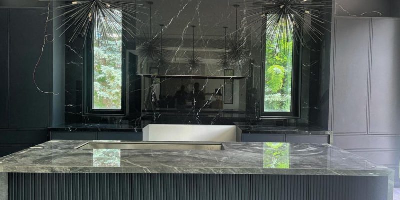
A countertop with dramatic veining, strong mineral movement or high colour contrast generally benefits from a simpler backsplash. The backsplash may repeat the countertop’s background colour or use a restrained texture that does not interrupt the slab pattern.
Quiet does not have to mean plain. A soft tonal tile, lightly textured porcelain or subtle matching slab can add depth while allowing the countertop to remain dominant.
A countertop with a consistent colour or restrained pattern provides more freedom for the backsplash. The wall can introduce stronger movement, colour, geometry or a full-height feature panel without making the kitchen feel overloaded.
This approach works particularly well when the backsplash is visible from adjacent rooms or positioned behind a range hood as a deliberate focal area.
Both the countertop and backsplash can contain visible pattern, but their scale and direction should differ enough to avoid visual conflict. A broad-veined countertop may work with a smaller repeating pattern, while two large directional patterns require careful alignment and colour control.
The objective is not to eliminate variation. It is to create a relationship in which one pattern leads and the other supports the complete composition.
Matching does not require the countertop and backsplash to be the same colour or material. A successful combination can be tonal, complementary or deliberately contrasting, provided the relationship appears intentional within the complete kitchen.
A tonal combination uses related shades from the same colour family. For example, a warm white countertop may be paired with a cream, pale greige or lightly veined backsplash.
This approach can create a calm and visually continuous kitchen, particularly when cabinetry and flooring already introduce texture or colour. To prevent the design from appearing flat, vary at least one element:
A polished countertop with a honed backsplash, or a quiet slab beside subtly textured cabinetry, can create distinction without introducing a strong contrast.
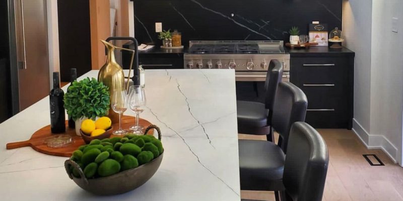
Contrasting light and dark surfaces can establish a clear visual hierarchy. A dark countertop may be paired with a lighter backsplash to brighten the wall, while a pale countertop can support a deeper range-wall feature.
Strong contrast works best when repeated elsewhere in the kitchen. Cabinet hardware, appliances, window frames or flooring can connect the darker surface to the rest of the design.
Contrast should also be evaluated at the joint between the countertop and backsplash. A sharp colour change draws attention to the line, wall irregularities and any visible caulking or seam.
The countertop and backsplash can use different materials while sharing undertones, vein colours or surface character. A natural quartzite countertop, for example, may work with a quiet porcelain panel that repeats its background tone without attempting to imitate every vein.
Complementary combinations are often more flexible than an exact match because they allow each material to retain its own identity. The goal is connection rather than duplication.
Homeowners deciding between a continuous slab surface and a more segmented wall finish can also compare the practical and visual differences in our stone slab backsplash vs tile guide.
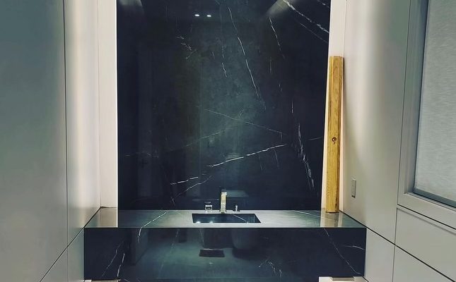
Continuing the same material from the countertop onto the wall can create a highly coordinated result. This approach is commonly used with natural stone, quartz and large-format porcelain, but it requires more planning than simply ordering the same product name.
When the countertop and backsplash are cut from the same slab or coordinated slabs, the layout may be planned to continue colour movement from the horizontal surface onto the wall.
Exact vein continuity is not always possible or necessary. Countertop depth, wall height, cutouts and slab dimensions influence which sections can be used. A visually balanced layout may be more practical than forcing a vein to connect at every joint.
The same slab can be used as:
A full-height application creates stronger material continuity, while a partial installation can preserve more visual contrast with the wall or cabinetry.
For detailed planning of panel height, seams, cabinetry transitions and range-wall layouts, see the full-height stone backsplash design guide.
Using one material across both surfaces does not mean every component will fit efficiently within one slab. Countertops typically require long horizontal pieces, while backsplashes need vertical panels with specific heights and cutout locations.
Pattern direction can further reduce usable yield.


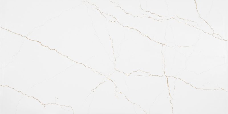
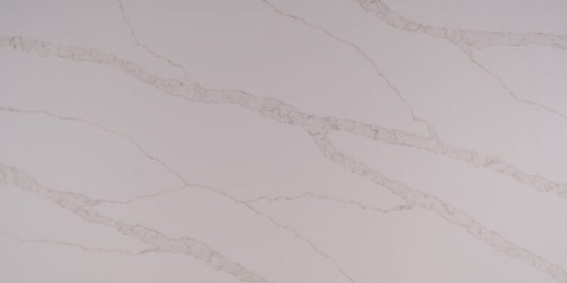
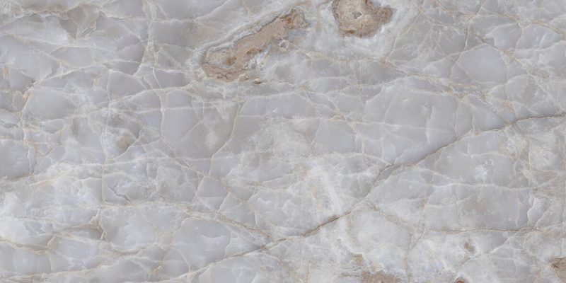
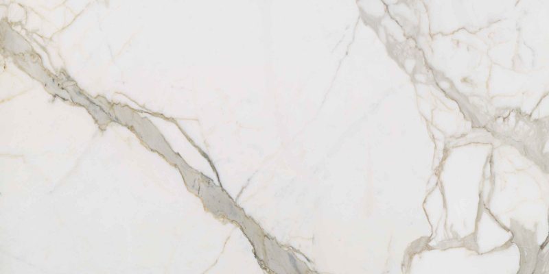


Before approving a same-slab design, review:
Material continuity is not automatically the best choice. A dark, highly patterned or heavily veined slab can become visually dominant when extended across several horizontal and vertical surfaces.
A quieter backsplash may be more effective when the kitchen already includes:
The amount of pattern should be assessed from the room’s main viewing points, not only from directly in front of the backsplash.
The material category provides a useful starting point, but the actual slab, colourway and finish should guide the final decision. Not every quartz, granite or marble countertop has the same visual character.
Quartz countertops range from nearly solid colours to printed designs with broad marble-style movement. A quiet quartz surface can support tile, texture or a stronger wall panel, while a heavily veined quartz usually benefits from a more restrained backsplash.
When using matching quartz on the wall, confirm that the selected product and application comply with the surface manufacturer’s requirements, particularly around heat-producing appliances.
Useful design approaches include:
Granite can contain multiple minerals, colour shifts and small- or large-scale movement. The backsplash does not need to repeat every colour visible in the slab.
Identify the granite’s background colour first, then decide whether the backsplash should relate to that background or highlight a secondary mineral tone. Highly active granite often pairs best with a quieter wall, while more uniform granite allows greater freedom.
A full slab should be reviewed because a small granite sample may not represent the overall pattern.
Marble combinations should account for the stone’s background tone, vein colour and finish. A marble with warm grey or gold movement can feel disconnected from a cold blue-white backsplash even when both are marketed as white.
Possible approaches include:
Care requirements should also be considered when extending marble into cooking or sink areas. The visual match should not be evaluated separately from the homeowner’s expectations for natural variation and maintenance.
Quartzite often has broad natural movement and visible variation across the slab. A backsplash should generally support the overall composition rather than compete with the strongest veins.
When the same quartzite is used vertically, layout planning becomes especially important because the wall panels may need to be selected from specific slab areas. A quieter complementary backsplash can preserve the quartzite as the main focal surface while reducing material complexity.
Porcelain surfaces use controlled printed patterns that may repeat across slabs or panels. When countertop and backsplash come from the same collection, review how the printed direction changes between horizontal and vertical applications.
Matching porcelain can create a precise modern composition, but repeating a large printed vein across several panels may require careful selection and sequencing.
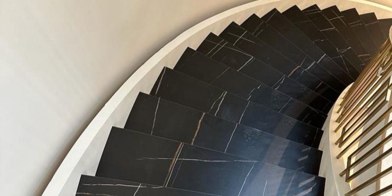
Soapstone and other dark countertops can create strong contrast with pale backsplashes, warm wood cabinetry and lighter flooring. Their matte or subdued appearance may also work with textured or honed wall finishes.
A dark backsplash can create a more enveloping composition, but lighting and cabinet colour become especially important. In compact or low-light kitchens, extending a dark material across the wall may make the room feel visually heavier.
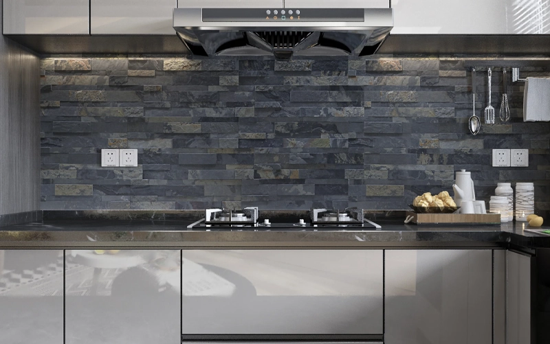
The countertop and backsplash should not be selected as an isolated pair. Cabinet colour, wood tone, flooring and fixed architectural finishes can change how the same combination appears.
Painted cabinets often reveal undertones that become more noticeable beside stone or porcelain. Warm white cabinets may work with cream, taupe or warm-veined surfaces, while cooler cabinetry can support cleaner greys and blue-based tones.
Wood cabinets introduce grain, colour variation and visual movement. When the cabinetry is already active, simpler countertop and backsplash patterns can create balance.
Flooring occupies a large visual area and can influence whether the kitchen feels warm, cool or neutral. The backsplash does not need to match the floor, but an unrelated undertone can make the room feel divided.
Review countertop and backsplash samples from standing height so that the flooring remains visible in the same view.
Hardware and appliances can help connect contrasting materials. Black, brass, nickel or bronze details may repeat colours already present in the countertop veins or backsplash pattern.
These smaller elements should support the main material relationship rather than become the basis for selecting an otherwise incompatible countertop and backsplash combination.
Pattern and finish influence how the countertop and backsplash interact from different distances. Two materials may share compatible colours but still compete because their patterns are similar in scale or their finishes create an unintended contrast.
A countertop with broad, directional veining often works best with a backsplash that has limited movement or a smaller, more regular pattern. Pairing two large-scale patterns can make it difficult for either surface to establish visual priority.
Smaller repeating patterns can complement a quieter countertop, but their repetition becomes more noticeable across a large backsplash area. A pattern that looks subtle on one sample may feel much busier when installed across an entire wall.
When both surfaces include movement, compare:
Matching finishes can create continuity, while combining finishes can add controlled contrast. A polished countertop beside a honed or matte backsplash may create depth without introducing another colour.
Finish also affects how a surface responds to light. Glossy backsplashes reflect cabinetry, windows and under-cabinet lighting, while matte finishes tend to absorb more light and present colour more evenly.
When selecting different finishes, review how the joint between them appears. A highly reflective backsplash may make a quieter countertop look flatter, while two matte surfaces can create a softer and more uniform composition.
Texture can add dimension to a simple material palette, but deeply structured or irregular surfaces may require more effort to clean in cooking and sink areas.
The desired visual effect should be balanced with the location of the backsplash. A textured accent may work well away from heavy splatter zones, while a smoother surface may be more practical directly behind a sink or preparation area.
Care requirements depend on the specific material and finish. Cleaning guidance should follow the surface manufacturer or stone supplier rather than a single routine applied to every backsplash.
Backsplash height changes the amount of colour and pattern visible in the kitchen. The same material can appear restrained as a short accent or become the dominant feature when extended to cabinetry or the ceiling.
A backsplash extending from the countertop to the underside of upper cabinets provides continuous wall protection across the main work area. It also creates a clear visual band between the countertop and cabinetry.
This format works well when the material has enough presence to connect the kitchen finishes without overwhelming the room.
Extending the backsplash higher behind a range or hood can create a focused feature without covering every wall in the same material. This approach allows stronger veining or contrast to appear in one controlled location.
The width of the range, hood, cabinets and surrounding wall should be reviewed together so the feature does not appear narrower or wider than the architectural elements around it.
A short stone upstand can create a direct material connection with the countertop while leaving the remaining wall available for paint, plaster or another backsplash finish.
This approach may suit kitchens where:
A short upstand should not be described as equivalent to a complete splash-zone backsplash where broader wall protection is required.
Without upper cabinets, the backsplash has no automatic stopping point. It may terminate at a shelf, hood, window, architectural line or the ceiling.
The termination should appear intentional. Arbitrary horizontal edges can make even well-matched materials look unfinished. Review the full wall elevation before deciding how high the material should extend.
Two products described as white, beige or grey may have different undertones. Always compare the actual materials together.
A highly veined countertop and an equally active backsplash can compete when their movement, contrast and scale are too similar.
A countertop and backsplash may look compatible in isolation but feel disconnected once placed beside the cabinetry and flooring.
Screen colour, photography and image editing cannot reliably represent an installed surface. Physical samples and full slabs should be reviewed whenever possible.
A backsplash should be viewed vertically because light and reflection affect wall surfaces differently from countertops.
Using one material can create continuity, but it may also make a small kitchen feel visually heavy or cause a dramatic pattern to dominate too many surfaces.
Material quantity, panel layout, outlets and visual balance all depend on the selected backsplash height. It should be established before final layout approval.
Even in a design-focused decision, electrical openings affect the visible pattern. Numerous cutouts can interrupt veins, tile layouts or bookmatched compositions.
A popular colour or pattern will not necessarily coordinate with fixed cabinetry, flooring and architectural details. The complete room should guide the decision.
Final Approval Tip: Photograph the shortlisted materials together in the kitchen, but make the final decision from the physical samples. A photograph is useful for comparison, not as a replacement for viewing the actual colour, texture and finish.
They should coordinate, but they do not need to be identical. They may share undertones, colours or material movement while differing in pattern, texture or finish.
In most projects, choose the countertop first because it is usually less flexible and covers a larger surface. Select the backsplash first when it is a fixed feature material or the intended focal point.
A quieter backsplash with a related background colour, restrained texture or smaller-scale pattern generally allows a highly active countertop to remain dominant.
Yes, when slab dimensions, material yield and pattern direction support the layout. Exact vein continuity may require coordinated slab planning and is not always possible or necessary.
First identify whether the quartz has a warm, cool or neutral background and review the colour of its printed veins. Compare backsplash samples beside the actual quartz, cabinetry and lighting rather than selecting only by the product’s white colour description.
The backsplash should relate to the complete kitchen. It can connect more strongly with the countertop, cabinetry or both, provided the undertones and visual hierarchy remain coherent.
A successful countertop and backsplash combination is based on material relationships rather than exact colour duplication. Confirm the fixed surfaces, identify the focal point and compare undertones, pattern scale, finish and height before approving the final design.
For custom wall panels, matching slab applications and full-height kitchen surfaces, explore Teccorp Stone’s kitchen stone backsplash services.