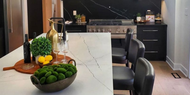
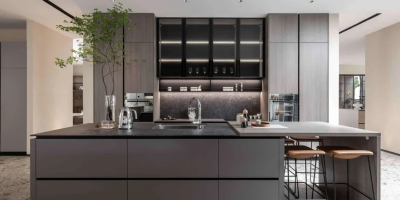
Countertop colors for kitchen cabinets should be selected by comparing more than a white, gray or black sample. Cabinet undertones, natural light, flooring, backsplash materials, hardware and the amount of pattern in the countertop all influence whether the finished kitchen feels coordinated.
A countertop colour may appear warm in a showroom but look cooler beside blue-white cabinets or gray flooring. A heavily veined surface may create a strong focal point beside simple slab cabinets, while the same pattern can compete with detailed wood grain, decorative doors or a patterned backsplash.
The goal is not necessarily to match cabinets and countertops exactly. Many successful kitchens use controlled contrast: light countertops with dark cabinets, charcoal surfaces with pale wood, or warm cream stone with muted green or navy cabinetry.
This guide explains how to compare countertop colours, undertones, patterns and finishes with modern and transitional kitchen cabinets. For information about cabinet structure and installation readiness, review how cabinet design affects countertop installation.
The following combinations provide a practical starting point. Final decisions should still be made using actual samples viewed beside the cabinet finish and other permanent kitchen elements.
| Cabinet Finish | Countertop Direction | Main Design Effect |
|---|---|---|
| White cabinets | Warm white, gray, charcoal or controlled veining | Creates either a light continuous palette or defined contrast. |
| Black or charcoal cabinets | White, cream, pale gray or light veined surfaces | Balances the visual weight of dark cabinetry. |
| Light wood cabinets | Cream, taupe, warm gray, white or muted charcoal | Supports a natural, warm or Scandinavian-inspired palette. |
| Dark wood cabinets | Warm white, beige, pale gray or restrained pattern | Adds separation while preserving the richness of the wood. |
| Navy or green cabinets | Soft white, cream, light gray or compatible veining | Keeps coloured cabinetry as the main feature. |
| Two-tone cabinets | A controlled neutral connecting both cabinet colours | Creates continuity between contrasting cabinet sections. |
These combinations are not fixed rules. Undertones and lighting can make two products with similar colour names appear noticeably different once installed together.
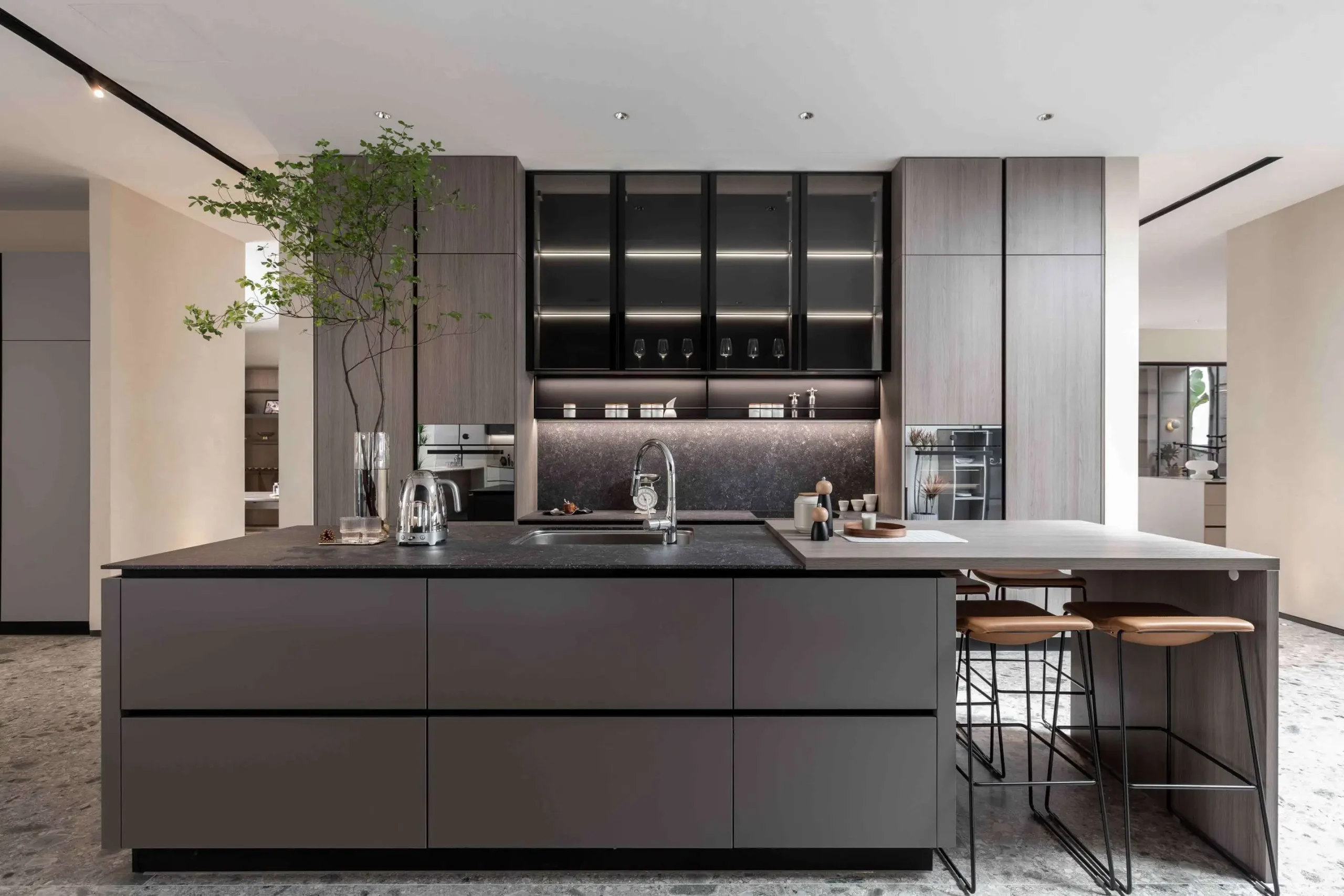
A colour name such as white, beige or gray provides only a general category. The final appearance depends on the colour underneath, the pattern on the surface and the materials surrounding it.
Cabinet finishes can contain warm, cool or neutral undertones. Warm cabinets may include cream, yellow, red or brown notes, while cool finishes may lean toward blue, green or violet.
Countertops do not need to repeat the exact undertone, but the relationship should appear intentional. For example:
Small differences in undertone can become more visible across large cabinet and countertop areas. Samples should therefore be viewed side by side rather than selected from separate displays.
Light countertops can reflect available light and may help a compact or shaded kitchen feel more open. Dark countertops can add visual weight, contrast and definition, particularly in kitchens with pale cabinetry or substantial natural light.
This does not mean small kitchens must use white surfaces or large kitchens must use dark stone. The result also depends on wall colour, flooring, backsplash, artificial lighting and the amount of upper cabinetry.
A dark countertop on a large island may create a useful focal point while lighter perimeter surfaces keep the rest of the room visually open. Conversely, a continuous light surface can help connect multiple countertop runs in a compact layout.
Countertop pattern should be considered alongside cabinet door style, wood grain, backsplash and flooring. When several permanent elements have strong visual movement, the kitchen can feel crowded.
A heavily veined or multi-tone countertop generally works best when surrounding cabinetry is relatively simple. Detailed cabinet doors, pronounced wood grain or patterned tile may coordinate more easily with a quieter countertop.
The size of the surface also matters. A dramatic vein may appear balanced on a large island but fragmented across narrow countertop sections with multiple openings and seams.
Polished, honed, matte and textured finishes reflect light differently and can change how the same colour appears.
The countertop finish does not have to match the cabinet finish exactly. A matte cabinet can be paired with a polished surface for controlled contrast, or with a honed surface for a quieter, more uniform appearance.
Colour Selection Rule
Compare cabinet, countertop, flooring and backsplash samples together under the actual kitchen lighting. Evaluate undertone, contrast, pattern and finish as one complete palette.
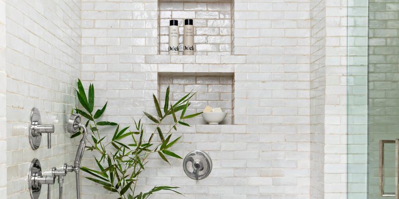
White and off-white countertops can support both high-contrast and low-contrast kitchen palettes. The result depends on whether the surface is a crisp white, warm white, cream-based white or a veined design containing gray, beige, gold or taupe movement.
White countertops commonly coordinate with:
White-on-white kitchens require careful sample comparison. A blue-white countertop beside warm cream cabinets may make the cabinetry appear yellow, while a warm off-white surface beside cool white cabinets may look beige.
A very bright white countertop can feel visually sharp when combined with cool gray floors, blue-white cabinets, stainless steel appliances and limited natural light.
Warm veining, cream undertones, natural wood, warmer lighting or a textured backsplash can soften the palette. The goal is not to add warmth automatically, but to ensure the countertop works with the permanent finishes already selected.
For available surface options, browse Teccorp Stone’s quartz, porcelain and marble countertop collections.
Beige, cream and taupe countertops create a warmer neutral palette than crisp white or cool gray. They can work particularly well with natural wood, warm white, muted green and soft greige cabinetry.
Wood cabinetry contains visible grain and undertones that may lean yellow, orange, red, brown or gray. The countertop should support the dominant wood tone without repeating it so closely that the surfaces appear visually flat.
Useful combinations may include:
Highly yellow beige countertops can compete with orange-toned wood, while cool gray surfaces may appear disconnected from very warm cabinetry. Actual samples should be viewed against the cabinet door rather than selected from colour names alone.
Warm neutrals can support a minimalist kitchen without creating the stark appearance sometimes associated with pure white surfaces. They pair well with simple slab doors, natural wood, brushed metal hardware and restrained backsplash materials.
In an open-concept layout, beige or taupe countertops can also connect the kitchen to warm flooring, adjacent furniture and neutral wall colours.
Gray countertops range from pale silver and concrete-inspired surfaces to deep charcoal stone. Their versatility depends on undertone, pattern and the amount of contrast created with the cabinetry.
Light gray countertops can coordinate with white, black, charcoal, navy and some natural wood cabinets. They offer more visual definition than white while remaining relatively neutral.
Concrete-look quartz or porcelain may suit modern cabinets with simple lines, but the gray should be checked against flooring and wall colours. A cool gray countertop beside warm beige flooring may create an unintended colour conflict.
Light gray is also useful when the kitchen already contains strong cabinet colour or wood grain and the countertop should remain visually quiet.
Charcoal countertops can add depth without creating the absolute contrast of black. They often work with white, light wood, greige or muted coloured cabinetry.
Dark gray surfaces should be reviewed under the actual kitchen lighting because low light can reduce visible pattern and make the countertop appear darker than the sample.
On larger islands, charcoal can create a focal point while lighter perimeter countertops maintain balance. When using one countertop throughout the kitchen, cabinet colour and backsplash selection become more important in controlling the overall visual weight.
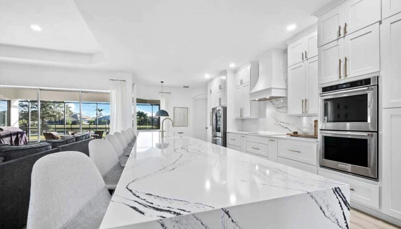
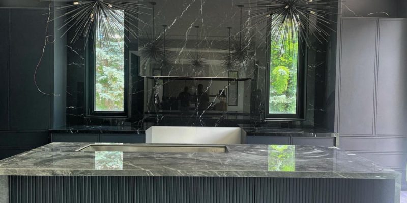
Black, charcoal, espresso and other dark countertops create strong visual weight. They can define a light cabinet layout, support a darker monochromatic design or provide contrast against natural wood.
Dark countertops with white cabinets create a clear, graphic contrast.

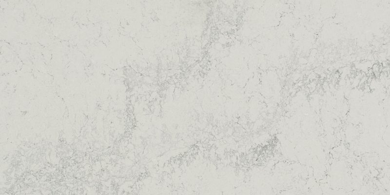
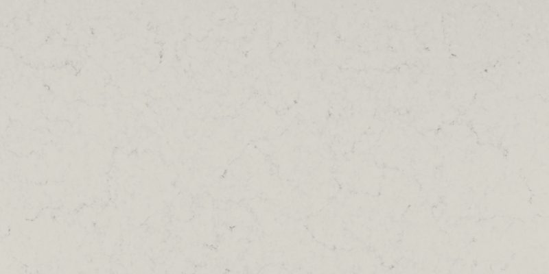
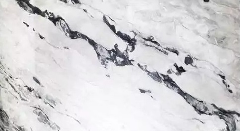
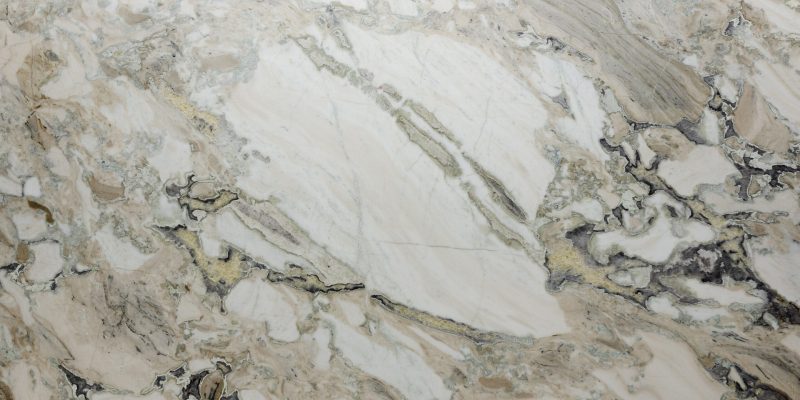



A polished black surface creates stronger reflection and contrast, while a honed or matte finish produces a softer appearance. In kitchens with limited light, the backsplash, walls and under-cabinet lighting should be considered so the work area does not feel visually heavy.
Dark countertops can work with light oak, natural maple, muted green, beige or warm gray cabinets. With dark wood, navy or black cabinets, the palette becomes more tonal and may require lighter walls, flooring or backsplash materials for separation.
The undertone of the dark surface matters. Some charcoal countertops lean blue or cool gray, while espresso or brown-black stones may coordinate more naturally with warm wood and brass-toned hardware.
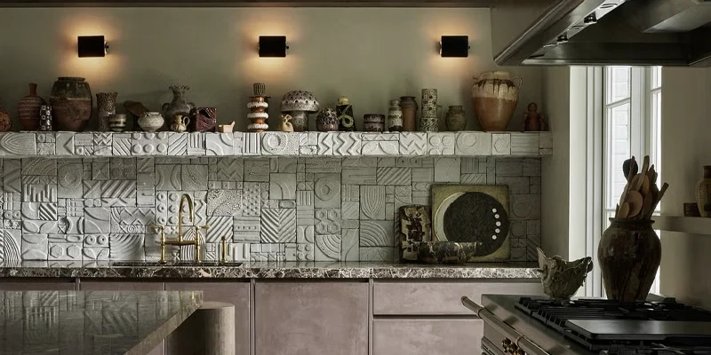
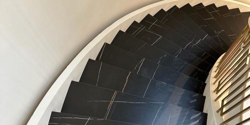
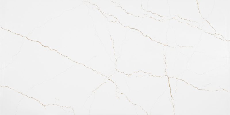
Veined and multi-tone countertops can become the main visual feature of the kitchen. Their pattern should be coordinated with cabinet colour, door style, island size, seams and the surrounding backsplash.
A pronounced vein or organic pattern often works best with relatively simple cabinetry. Flat-panel or restrained shaker doors allow the countertop movement to remain the focal point.
When cabinets have strong wood grain, decorative profiles or multiple colours, a quieter countertop may create better balance. A patterned countertop, patterned backsplash and highly figured wood used together can make the kitchen feel visually crowded.
The countertop layout also affects how the pattern appears. Large islands can display long veins effectively, while narrow runs, corners and multiple openings may interrupt the design.
Veins may contain gray, beige, gold, brown, blue or green notes. These colours do not need to match the cabinets exactly, but one or more should relate to the cabinet, flooring, backsplash or hardware palette.
For example:
Whenever possible, review the full slab or a large-format product image. Small samples may not show the pattern scale, vein spacing or colour variation that will appear across the finished countertop.
Pattern Planning Principle
When the countertop has strong movement, simplify at least one surrounding element. Cabinet doors, backsplash and flooring should support the surface rather than compete with it.
The cabinet finish provides the visual base of the kitchen. Countertop colour should either reinforce that base or create deliberate contrast without competing with the cabinet undertone, wood grain or door style.
White cabinets can work with a broad range of countertop colours, including warm white, soft gray, charcoal, beige and restrained veining.
The most important issue is undertone compatibility. Cool white cabinets may coordinate better with crisp white, gray or cool-veined surfaces, while warm white cabinets often work more naturally with cream, taupe, beige or warm-veined countertops.
Useful directions include:
Dark cabinets already create strong visual weight, so lighter countertops are often used to add separation and improve visibility across the work surface.
White, cream, pale gray and lightly veined countertops can balance black or charcoal cabinetry. A dark-on-dark combination can also work, but the result should be reviewed carefully with the flooring, wall colour, backsplash and lighting.
When both cabinets and countertops are dark, variation in texture, finish or undertone helps prevent the surfaces from appearing flat or indistinguishable.
Light oak, maple and other pale wood cabinets can coordinate with cream, warm white, taupe, pale gray and selected dark countertops.
A light neutral countertop can create a calm and continuous palette, while charcoal or dark stone can provide stronger definition. The countertop should be checked against the dominant wood undertone rather than selected only because it is labelled neutral.
Strongly patterned stone may compete with pronounced wood grain. When the cabinet grain is visually active, a quieter countertop often produces a more balanced result.
Dark walnut, espresso and deep stained wood cabinets often benefit from lighter countertops that separate the work surface from the cabinetry.
Warm white, cream, beige and pale gray can preserve the richness of the wood without making the kitchen feel excessively dark. Countertops with subtle gold, brown or taupe movement may also connect naturally with warm wood tones.
Dark countertops can still be used, but the complete palette should include enough visual separation through walls, flooring, backsplash or lighting.
Coloured cabinets usually work best when the countertop supports rather than competes with the cabinet colour.
Soft white, cream, pale gray and restrained veining are common starting points for navy, sage, forest green and muted blue cabinetry. The vein colour may also connect the cabinets with hardware, flooring or backsplash materials.
When the cabinet colour is the main feature, avoid combining it with an equally dominant countertop pattern unless the design has been reviewed using large samples or full-slab imagery.
Cabinet Finish Rule
Use cabinet colour, undertone, grain and door style to determine how much contrast and pattern the countertop should introduce.
Cabinets and countertops are not viewed in isolation. Flooring, backsplash, wall colour, hardware and appliances can either connect the palette or introduce additional competing undertones.
A backsplash can help bridge the cabinet and countertop when it contains a colour present in both surfaces. It can also create separation when the cabinets and countertop are similar in tone.
Hardware provides a smaller accent but can reinforce the overall direction:
Flooring is especially important because it covers a large visual area. A countertop that works with the cabinets but conflicts with the floor undertone may make the kitchen feel disconnected.
For a full-height stone or porcelain wall application, review Teccorp Stone’s kitchen stone backsplash service.
Many colour problems result from selecting each surface separately rather than reviewing the kitchen as one complete palette.
A successful combination usually gives one or two elements visual priority while the remaining surfaces provide support and continuity.
Countertop samples should be reviewed beside the actual cabinet finish and other permanent materials before the slab or product is approved.
Use the following process:
Samples should be viewed vertically and horizontally because cabinet doors and countertops receive light differently. A surface that appears suitable when laid flat may look different beside a vertical cabinet panel.
For natural stone, the selected slab should be reviewed for variation, pattern direction and usable dimensions. For engineered or manufactured products, confirm how the full design repeats or changes across larger sections.
Sample Review Checklist
Compare large samples under the actual kitchen lighting and review cabinet, countertop, flooring, backsplash and hardware as one complete material palette.
White cabinets can coordinate with warm white, gray, charcoal, beige and veined countertops. The best option depends on the cabinet undertone, flooring, backsplash and desired level of contrast.
Light white, cream, beige and pale gray surfaces can balance dark cabinetry. Dark countertops may also work when the kitchen has enough lighting and visual separation.
Cream, warm white, taupe, pale gray and selected charcoal countertops can work with light wood. The countertop undertone should be compared with the wood’s dominant yellow, brown, red or gray notes.
Neither approach is universally better. Lighter countertops create separation and reflect more light, while darker surfaces add depth and stronger contrast.
Yes. A cool white countertop may conflict with warm white cabinets, or the reverse. Compare the samples directly to confirm that the undertones are compatible.
The pattern should be considered with the cabinet grain, door style, flooring and backsplash. A stronger countertop pattern usually works best when surrounding elements are relatively restrained.
They do not need to match exactly. The backsplash should relate to the countertop and cabinets through colour, undertone, texture or pattern without competing for attention.
It should be selected after the main cabinet finish and layout are known, but before final fabrication and backsplash decisions. Samples should be reviewed together before ordering.
A suitable countertop colour should work with the cabinet undertone, kitchen lighting, flooring, backsplash and amount of visual movement in the room.
Teccorp Stone provides countertop material guidance, professional measurement, custom fabrication and installation for kitchen projects across Toronto, the GTA and its Ontario service areas.
Share cabinet photographs or samples, kitchen images, flooring and backsplash details, preferred countertop colours and approximate project dimensions for a more useful material review.
Compare Countertop Colors for Your Kitchen
Review cabinet undertones, lighting, pattern, finish and surrounding materials before selecting the final surface.
Request a Countertop Quote
Browse Countertop Materials
Explore Kitchen Countertop Services